A clothing brand logo is more than a decorative mark on a T-shirt or hoodie. It is one of the first visual elements people notice, and it can help customers recognize a brand across clothing labels, packaging, social media, and retail displays. A well-designed logo also communicates the personality behind the brand, whether it feels minimal, luxurious, rebellious, playful, or inspired by street culture.
For clothing brand owners, fashion entrepreneurs, and graphic designers, choosing the right clothing brand logo design is an important step in building a consistent visual identity. Some brands use simple monograms, while others rely on bold typography, illustrated mascots, vintage emblems, or experimental symbols. Each approach creates a different impression and offers unique opportunities for apparel design.
If you are developing a new fashion label or refreshing an existing identity, these 10 clothing brand logo ideas can help you explore different creative directions. From timeless minimalist marks to expressive streetwear lettering, here is how to make your brand more recognizable.
1. Minimalist Geometric Logo
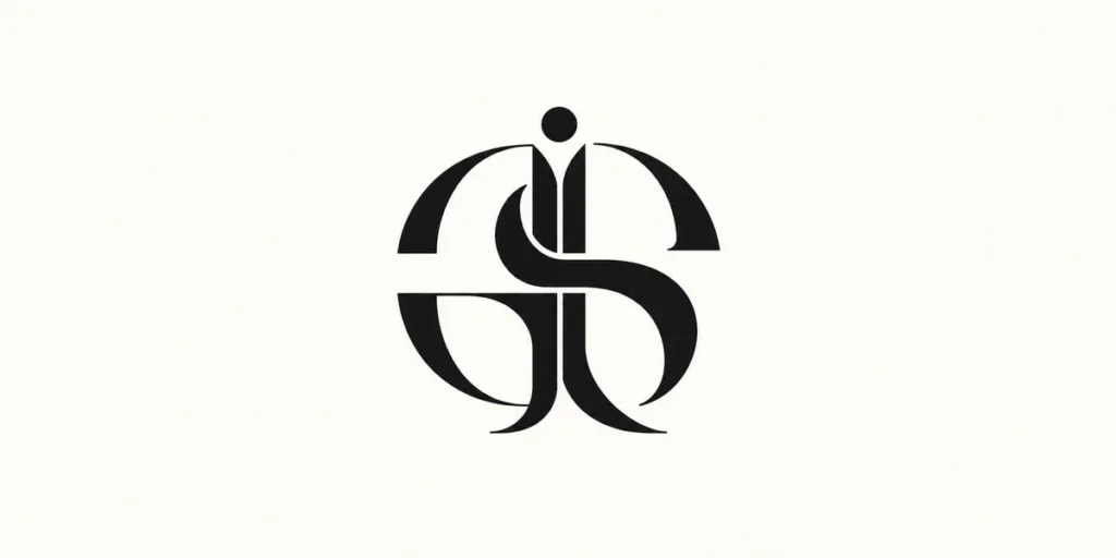
A minimalist geometric logo uses simple shapes, clean lines, and carefully balanced proportions to create a distinctive brand mark. Circles, squares, triangles, and abstract line combinations can form a symbol that feels modern without relying on complicated details.
This style works particularly well for contemporary fashion labels, premium basics, activewear, and clothing brands that prefer a clean visual identity. Instead of using multiple decorative elements, the design focuses on one recognizable shape or a combination of a few simple forms.
Negative space can also play an important role. For example, two overlapping geometric shapes might create a subtle secondary symbol, while a simple circular mark could represent unity or continuity.
Design tips:
- Start with one or two basic geometric shapes.
- Keep the proportions balanced and easy to recognize.
- Avoid small details that may disappear when printed or embroidered.
- Test the symbol in black and white before adding color.
A geometric logo should remain recognizable when reduced to a small clothing label or used as a single-color chest print. Its simplicity makes it flexible across different products and brand applications.
2. Custom Monogram Logo
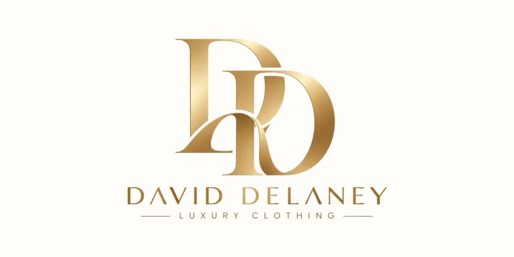
A custom monogram logo uses one or more initials from a brand name to create a compact visual signature. It can be especially useful for fashion labels with short names, founder-led brands, or premium clothing collections.
Rather than simply typing two letters in a standard font, designers can customize their proportions, connect their strokes, or combine them into a new symbol. Interlocking initials, symmetrical arrangements, and overlapping letterforms are common approaches.
For example, a brand named North Avenue could use the letters N and A to create a single emblem. The letters might share one vertical stroke or form a balanced geometric structure.
Design tips:
- Choose initials that are visually compatible.
- Experiment with overlapping and interlocking letterforms.
- Make sure each letter remains understandable.
- Check that the monogram works at small sizes.
Monograms are particularly practical for clothing tags, buttons, embroidery, woven labels, and small accessories. They can also become secondary brand marks alongside a full wordmark.
The most effective custom monograms feel intentionally designed rather than like ordinary initials placed next to each other.
3. Vintage Heritage Emblem
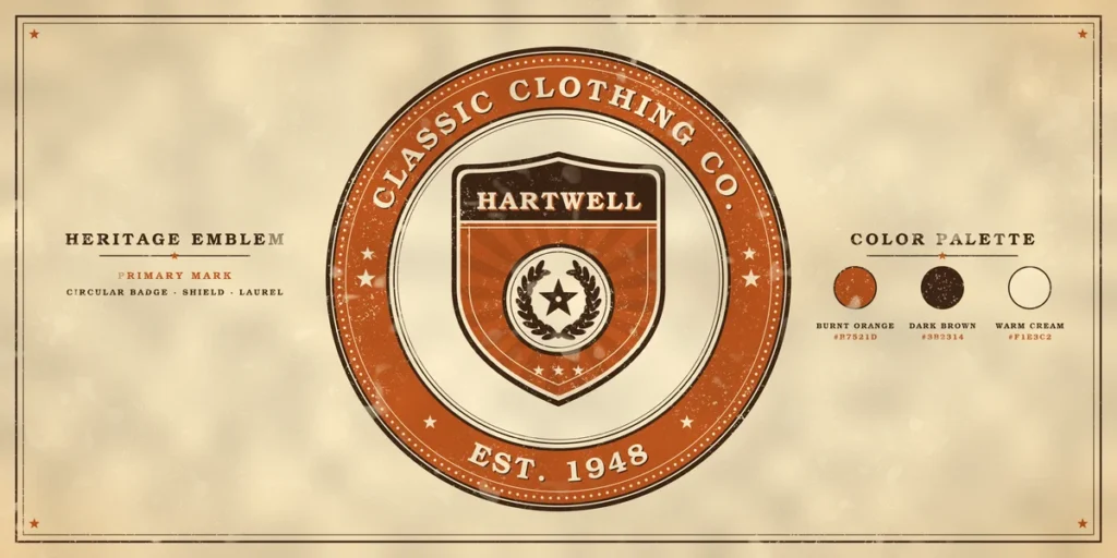
Vintage heritage emblems take inspiration from traditional sportswear, workwear, collegiate clothing, and classic apparel labels. They often feature circular badges, shield shapes, decorative borders, established dates, and serif or slab serif typography.
This logo style can give a clothing brand a sense of history and character, even when the business is relatively new. It is a suitable direction for denim labels, outdoor apparel, vintage-inspired streetwear, and lifestyle brands.
A heritage emblem might include the brand name in a circular arrangement, a small central symbol, and supporting details such as a location or collection name. However, the composition should remain readable rather than becoming overloaded with decorative text.
Design tips:
- Use a badge, shield, or circular composition.
- Combine a strong display typeface with smaller supporting text.
- Consider muted colors such as cream, dark brown, navy, or faded red.
- Introduce subtle texture only when it supports the concept.
For the typography, a retro display font can help establish the right visual character. Cikareotype’s Paradisea Font offers a more expressive retro direction that can inspire bold lettering in vintage-influenced apparel graphics.
A heritage emblem can work as a primary logo, but it is also useful as a secondary badge on sleeves, back prints, packaging, and woven labels.
4. Graffiti Streetwear Logo
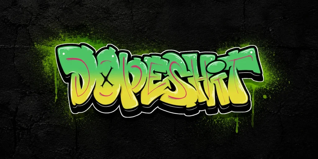
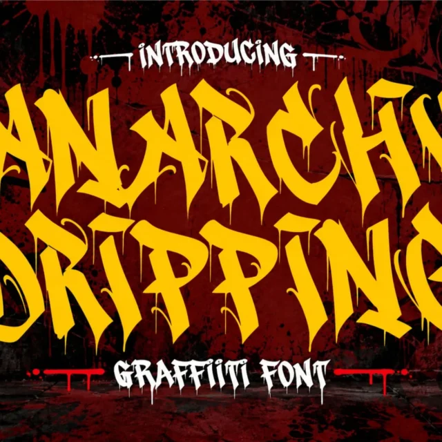
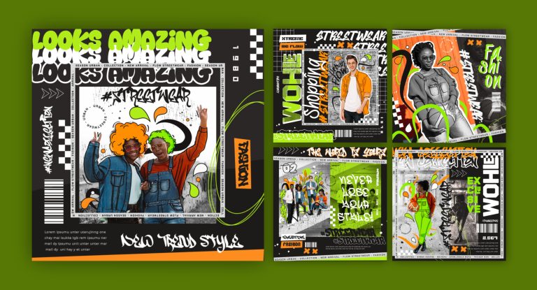
Graffiti streetwear logos use expressive lettering, irregular shapes, dynamic strokes, and bold outlines to create a strong urban identity. This style is closely associated with street culture, skateboarding, hip-hop, underground music, and independent fashion labels.
Unlike minimalist fashion marks, graffiti-inspired logos often make typography the main visual feature. Letters may overlap, stretch, tilt, or connect to create a sense of movement. Some designs also use outlines, shadows, drips, or hand-drawn details to make the lettering more distinctive.
This approach can work well for brands that want to communicate individuality, energy, and a rebellious attitude. However, the logo should still be recognizable. Excessively complicated lettering can make the brand name difficult to read, especially when printed at a small size.
Design tips:
- Start with a lettering style that reflects the brand personality.
- Experiment with wildstyle, bubble, tag, or dripping typography.
- Use outlines and shadows carefully.
- Keep the main brand name visually dominant.
- Create a simplified version for small applications.
For this concept, graffiti display fonts can provide a useful starting point. Explore Boogie Blast – Dripping Style Font for layered urban lettering, or Noctag Graffiti Font for a sharper street-inspired direction.
You can also browse the Cikareotype font collection for more graffiti lettering styles.
A graffiti logo can become a strong signature for a streetwear brand, especially when its lettering style is consistently used across clothing graphics, campaign artwork, and social media.
5. Abstract Symbol Logo
An abstract symbol logo communicates a brand identity through a distinctive shape rather than a literal illustration. It might use organic forms, geometric structures, unusual line arrangements, or a visual metaphor connected to the brand’s values.
For example, a clothing label inspired by movement could use a flowing symbol, while a brand focused on exploration might use an abstract form that suggests a direction or path. The symbol does not need to depict a shirt, hanger, or fashion accessory to represent a clothing business.
The advantage of an abstract mark is its flexibility. It can become a recognizable visual asset without depending on a long brand name or a specific lettering style.
Design tips:
- Begin with a simple concept or brand value.
- Explore several rough shapes before refining one.
- Avoid symbols that look too similar to common stock icons.
- Check how the mark appears in different sizes and colors.
- Build a consistent relationship between the symbol and the brand name.
An abstract logo often requires repetition before audiences associate it with a particular brand. Therefore, use it consistently across clothing labels, packaging, website graphics, and promotional materials.
The goal is not to make the symbol complicated. It is to create a simple shape with a distinctive visual character.
6. Bold Typography Wordmark
A bold typography wordmark uses the brand name itself as the main logo. Instead of relying on a separate icon, the designer creates a distinctive typographic treatment that makes the name memorable.
This approach is especially effective for streetwear labels, contemporary fashion brands, sportswear collections, and independent clothing businesses. A strong wordmark can work across T-shirt prints, hoodie graphics, storefront signage, website headers, and clothing tags.
The design may use condensed lettering, heavy weights, custom letter shapes, unusual proportions, or carefully adjusted spacing. Even small modifications can make a standard typeface feel more connected to the brand.
Design tips:
- Choose a typeface that reflects the brand’s personality.
- Adjust kerning and spacing manually.
- Consider customizing one or two distinctive letters.
- Test the wordmark in both horizontal and stacked layouts.
- Keep the name readable at different sizes.
For bold and expressive typography, a display font can help establish a recognizable visual direction. The Horison Font is one option for exploring energetic lettering in streetwear-inspired wordmark concepts.
Remember that a logo should not depend only on a fashionable typeface. The spacing, letter proportions, and overall composition are what turn typography into a brand identity.
7. Mascot Character Logo
A mascot character logo uses an illustrated figure, animal, or fictional character to represent a clothing brand. It can give the identity a friendly, playful, rebellious, or energetic personality depending on the character design.
Animals are common choices because they can communicate different qualities. A wolf might suggest strength, a bear can feel bold and approachable, while a rabbit could create a playful identity. However, the character should have a clear connection to the brand concept rather than being selected simply because it looks attractive.
Mascot logos are particularly suitable for skatewear, youth fashion, graphic T-shirt brands, sports-inspired clothing, and labels with a playful visual direction.
Design tips:
- Choose a character that supports the brand story.
- Develop a recognizable silhouette and facial expression.
- Keep the illustration simple enough for embroidery and printing.
- Create a one-color version for flexible production.
- Consider different poses for campaign graphics and merchandise.
A mascot can become more than a logo. It can appear across clothing collections, hang tags, stickers, packaging, social media content, and promotional illustrations.
For better consistency, establish a basic character style guide that defines its proportions, colors, expressions, and permitted variations.
8. Negative Space Logo
A negative space logo uses the empty areas between shapes or letters to reveal an additional image or hidden meaning. This technique can create a clever visual identity without adding unnecessary elements.
For example, a clothing brand might combine two letters so that the space between them forms a subtle arrow, animal silhouette, or abstract shape. Another approach is to use the interior of a letter to reveal a secondary symbol.
The strength of this style comes from its simplicity and visual discovery. When viewers notice the hidden shape, the logo can become more memorable.
Design tips:
- Begin with a clear primary shape or letter.
- Look for natural gaps where a secondary form could appear.
- Avoid forcing hidden meanings into the composition.
- Maintain enough contrast between positive and negative shapes.
- Test the logo at small sizes to ensure the detail remains visible.
Negative space logos are useful for modern fashion labels, minimalist apparel, and brands that want a more thoughtful visual identity.
However, the hidden element should support the main logo rather than make it difficult to understand. If viewers cannot recognize the primary mark, the concept may need to be simplified.
9. Japanese-Inspired Typography Logo
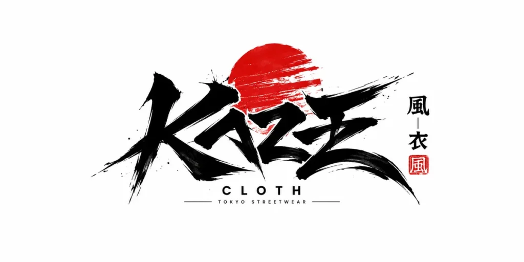
Japanese-inspired typography logos take visual inspiration from contemporary Japanese editorial design, fashion publications, streetwear graphics, and carefully arranged typographic compositions.
This direction may combine bold Latin lettering, vertical layouts, structured grids, minimal symbols, and carefully selected Japanese characters. The result can feel modern, editorial, and visually distinctive.
However, it is important to approach this style with cultural awareness. Japanese characters should not be used as random decoration. If a design includes Japanese writing, make sure the characters are accurate and appropriate for the intended meaning.
Design tips:
- Study Japanese editorial and fashion graphic design references.
- Experiment with vertical and asymmetrical layouts.
- Combine bold typography with restrained supporting elements.
- Use Japanese characters only when their meaning is understood and verified.
- Avoid overcrowding the composition with decorative symbols.
A Japanese-inspired logo can work particularly well for streetwear, contemporary casualwear, and fashion brands influenced by skate culture or modern editorial aesthetics.
The most effective approach is to learn from the visual structure and composition rather than simply copying recognizable cultural symbols.
10. Experimental 3D Logo
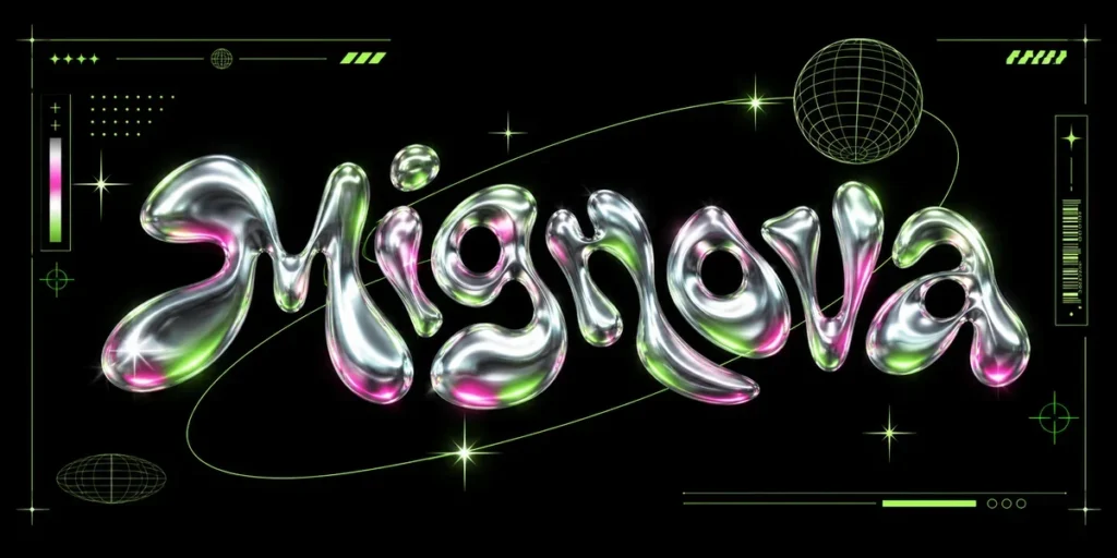
An experimental 3D logo uses dimensional lettering, metallic surfaces, sculptural forms, or layered visual effects to create a distinctive brand presentation. It can give a clothing identity a futuristic, digital, or high-impact appearance.
Chrome typography, inflated letters, extruded shapes, and reflective materials are examples of techniques that can make a logo feel dimensional. These treatments are especially useful for digital campaigns, collection announcements, promotional graphics, and experimental streetwear branding.
However, a 3D effect should not be the only thing that makes the logo recognizable. A complicated metallic treatment may look impressive on a screen but become difficult to reproduce on clothing labels or embroidery.
Design tips:
- Start with a strong and recognizable logo structure.
- Experiment with extrusion, reflections, and layered depth.
- Use materials that support the brand’s visual personality.
- Keep a flat version for practical production.
- Check the logo in monochrome before applying 3D effects.
Layered display typography can be a useful starting point for this concept. Mignova – Psychedelic Font offers layered and dimensional lettering styles that can inspire experimental logo presentations.
For a consistent identity, treat the 3D version as one visual treatment within a larger logo system. Keep the core shape or lettering recognizable even when the effects are removed.
How to Choose the Right Logo for Your Clothing Brand
With so many possible styles, choosing the right clothing brand logo design can feel challenging. The best approach is to start with your brand identity rather than selecting a visual trend first.
1. Understand Your Target Audience
Think about the people who will wear your products. A premium minimalist label may appeal to a different audience than a colorful graphic streetwear brand. Understanding your customers helps you choose a visual direction that feels relevant to them.
2. Define Your Brand Personality
Write down a few words that describe your brand. It might be bold, elegant, rebellious, playful, athletic, or timeless. Use these characteristics to guide your choice of typography, shapes, and colors.
3. Choose a Suitable Logo Style
Select a logo concept that supports your brand personality. A custom monogram may suit a refined fashion label, while graffiti lettering might be more appropriate for an independent streetwear brand.
4. Prioritize Readability and Versatility
Your logo should work across different formats. Check whether the design remains recognizable on a website, clothing label, small chest print, large back print, and social media profile image.
5. Consider Clothing Production
A logo that looks attractive on a screen may not work equally well in every production method. Fine details can disappear in embroidery, while complex gradients may be difficult to reproduce in certain printing processes.
Create practical versions for screen printing, embroidery, woven labels, and packaging.
6. Test Color and Monochrome Versions
A strong identity should not depend entirely on color. Test the logo in black, white, and a single-color version before finalizing the palette. This helps ensure that the design remains flexible across different materials and backgrounds.
Tips for Creating a Memorable Clothing Brand Logo
Once you have chosen a direction, refine the logo using a few practical principles.
- Keep it simple: Remove details that do not contribute to the brand identity.
- Make it original: Avoid copying existing fashion logos or relying on generic symbols.
- Use typography carefully: Letter shape, spacing, and weight can strongly influence the personality of a wordmark.
- Build a consistent system: Create primary, secondary, and simplified logo variations.
- Think about scalability: Make sure the design works from a small clothing tag to a large promotional graphic.
- Use color intentionally: Choose a palette that supports the brand personality and works across different materials.
- Test real applications: Preview the logo on T-shirts, hoodies, labels, packaging, and digital platforms before final approval.
A memorable logo is not necessarily the most complicated one. Often, a clear concept and consistent application are more valuable than adding extra visual effects.
From Our Desk: A Logo Should Feel Like the Brand
At Cikareotype, we see typography as an important part of visual identity. A typeface can influence how people perceive a clothing brand before they even see the product itself. Sharp lettering can create an aggressive streetwear attitude, while rounded forms can feel playful and approachable.
When developing a clothing logo, we recommend exploring several visual directions before committing to one. Try a wordmark, a monogram, and a symbol-based concept. Compare how each option looks on an actual T-shirt or hoodie rather than judging it only on a blank artboard.
For streetwear brands, expressive display lettering can become a strong visual signature. For other fashion labels, a simpler typographic mark may be more appropriate. The important thing is to choose a direction that feels authentic to the brand and remains consistent as the business grows.
Final Thoughts
A distinctive clothing brand logo helps establish recognition, communicate personality, and create a consistent visual identity across products and marketing materials. From minimalist geometric marks and custom monograms to graffiti lettering, mascot characters, and experimental 3D designs, each logo style offers a different way to express a fashion brand.
The right choice depends on your audience, brand personality, product direction, and practical production needs. Instead of following every popular design trend, focus on building a logo that represents what makes your clothing brand different.
Take time to experiment with shapes, typography, and layouts. Test your ideas on real apparel applications, refine the details, and create a visual identity that can grow with your brand.
Looking for expressive typography for your next streetwear project? Explore the Cikareotype font collection and discover more creative lettering inspiration for your designs.