Introduction
Halloween is a perfect opportunity for designers, illustrators, apparel brands, and content creators to experiment with bold visuals. The strongest Halloween design ideas do more than add a pumpkin to a dark background: they build a mood through typography, contrast, texture, character, and a clear visual hook. Whether you are creating a party poster, a limited-edition T-shirt, or a social media campaign, a consistent concept helps your work feel intentional and memorable.
This guide brings together 20 Halloween poster ideas, Halloween T-shirt design directions, and social media graphics you can adapt to different audiences. Use these ideas as a starting point, then customize the palette, layout, and details for your project. For a more urban take on spooky typography, explore Cikareotype’s Gorvex – Melting Halloween Graffiti Font and Antiink – Horror Dripping Street Brush Font.
1. Classic Haunted House Poster
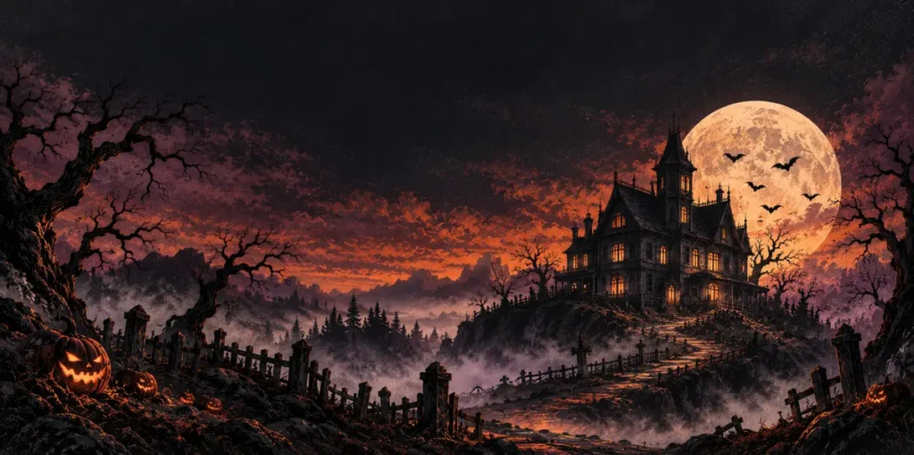
A haunted house is one of the most recognizable Halloween design themes. However, you can make this familiar concept feel fresh by experimenting with dramatic lighting, unusual perspectives, and atmospheric details.
Build the scene around a crooked Victorian house, a narrow moonlit path, twisted trees, and distant bats. Keep most of the artwork dark, then use pale moonlight and one warm window glow to guide the viewer’s eye.
For typography, choose a distressed display font that complements the eerie atmosphere. Position the main headline prominently and keep supporting information readable. This approach works especially well for haunted attraction promotions, Halloween party posters, and seasonal event graphics.
Also Read: Explore more creative ideas on the Cikareotype Blog.
2. Melting Horror Typography
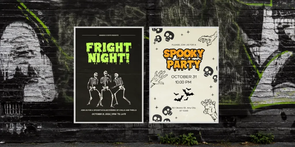
Melting typography is an effective way to make Halloween graphics look unsettling and expressive. Dripping letterforms can suggest slime, melting wax, or supernatural transformations, making them a strong choice for horror posters and alternative apparel.
Make the lettering the main visual element and keep supporting imagery simple. This helps the typography remain recognizable, especially when the design appears in small social media previews.
For an urban Halloween mood, try Gorvex – Melting Halloween Graffiti Font. Its melting-inspired style can complement slime graphics, horror headlines, and bold seasonal merchandise.
Also Read: Browse the Cikareotype Blog.
3. Retro Halloween T-Shirt Graphic
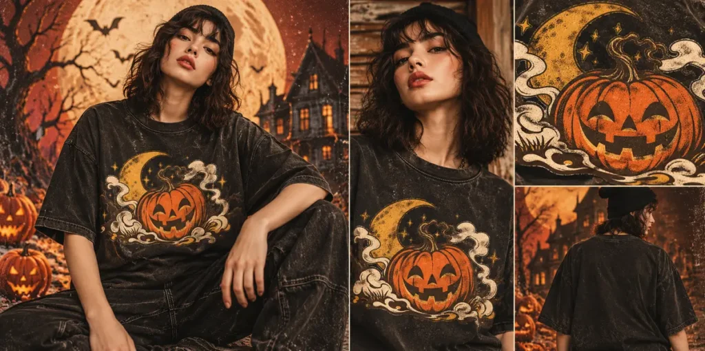
Retro Halloween graphics work well on apparel because limited colors and chunky shapes reproduce cleanly. Combine a grinning jack-o’-lantern, a crescent moon, vintage stars, and worn ink textures to create a nostalgic design.
Use a restrained palette of pumpkin orange, cream, faded mustard, and dark brown. Slightly distressed textures can make the artwork feel like a vintage thrift-store find rather than a generic seasonal graphic.
For the best results, create a strong central illustration and test it against different shirt colors. Make sure the silhouette remains clear and that small decorative elements do not disappear when printed.
4. Cute Ghost Social Media Post
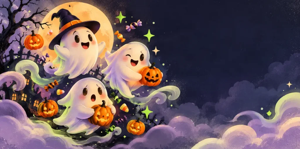
Not every Halloween campaign needs to feel frightening. Friendly ghosts, soft colors, and rounded shapes are ideal for family events, bakeries, boutiques, and playful creator accounts.
Give each ghost a distinct expression or personality. Add a few pumpkins, candy pieces, or sparkling stars to create a cohesive visual theme without overwhelming the composition.
This style is especially effective for Instagram posts, seasonal promotions, stickers, and carousel graphics. You can also turn the characters into a recurring visual series to make your brand more recognizable throughout the Halloween season.
5. Gothic Blackletter Flyer
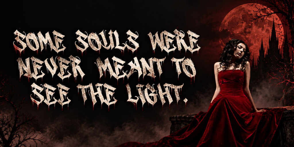
Gothic design combines dramatic lettering, ornate details, and dark romantic imagery. Pointed arches, antique frames, black roses, and candlelight can help create a sophisticated Halloween event flyer.
Balance decoration with readability. Use expressive gothic typography for the main headline, then pair it with a simpler typeface for dates, venue information, and ticket details.
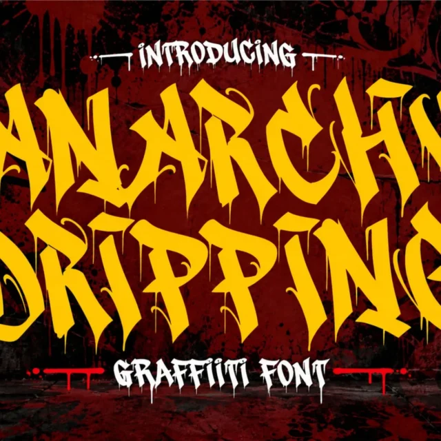
For a rougher horror aesthetic, explore Anarchy Dripping Font. Its horror-inspired lettering can work well for darker event posters, alternative merchandise, and dramatic social media graphics.
6. Horror Movie-Inspired Composition
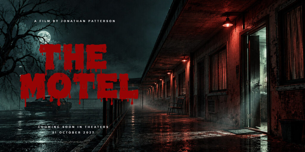
Cinematic horror design focuses on suspense, atmosphere, and visual storytelling. Instead of filling the composition with monsters and frightening objects, use a single unsettling focal point.
Consider an empty corridor, a half-open door, a shadowy staircase, or a distant figure beneath a flickering light. Strong contrast and carefully controlled lighting can create tension without making the artwork unnecessarily complicated.
This concept is suitable for haunted house promotions, horror movie nights, escape room advertisements, and Halloween event posters. Leave enough negative space for the headline so the image remains visually powerful.
7. Pumpkin Patch Illustration
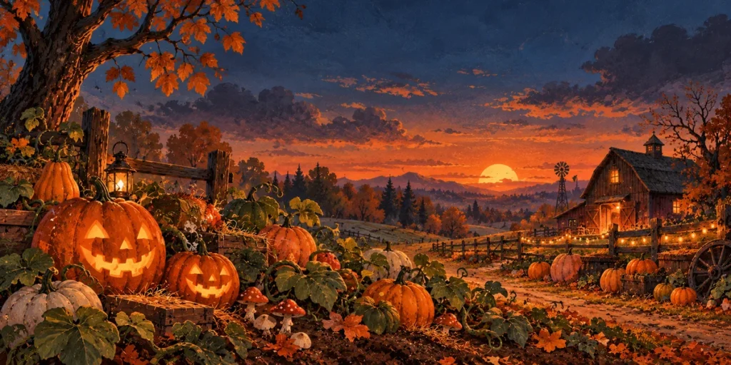
A pumpkin patch offers a warmer, autumn-focused direction for brands that want seasonal charm rather than intense horror. Layer pumpkins of different sizes with dry leaves, curling vines, mushrooms, and a distant barn.
Use warm orange tones against forest green or dusk blue to create contrast. Hand-drawn textures or painterly shading can make the artwork feel more personal and inviting.
This concept works well for autumn festivals, farmers’ markets, café promotions, family Halloween events, and seasonal product packaging. It can also be adapted into a coordinated set of social media graphics.
8. Skull and Botanical Design
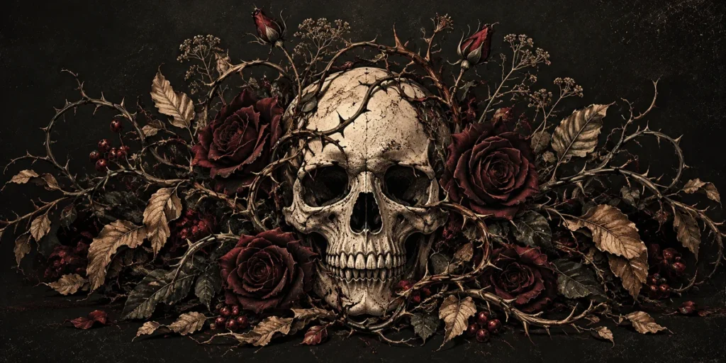
Combining skulls with flowers, thorny vines, and leaves creates a dark botanical style that suits alternative fashion, music artwork, and premium merchandise.
Keep the skull silhouette relatively simple, then surround it with intricate botanical details. A limited palette of bone ivory, charcoal black, and muted burgundy can give the composition a refined yet mysterious appearance.
For apparel, consider using a two- or three-color version to simplify printing. For posters and digital graphics, add finer engraved details to create depth and visual interest.
9. Neon Halloween Party Poster
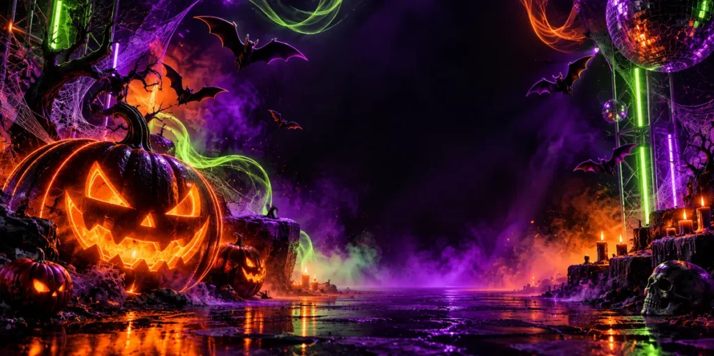
Neon palettes can help nightlife promotions stand out in crowded social media feeds. Combine electric purple, acid green, and vivid orange with glowing pumpkins, bat silhouettes, and atmospheric lighting.
Use a dark base to maintain strong contrast. However, avoid placing every detail over a bright glow, as this can make event information difficult to read.
Keep the main headline and essential details in a clear area of the composition. This style is ideal for nightclub events, DJ parties, themed gatherings, and late-night Halloween celebrations.
10. Minimalist Black-and-Orange Layout
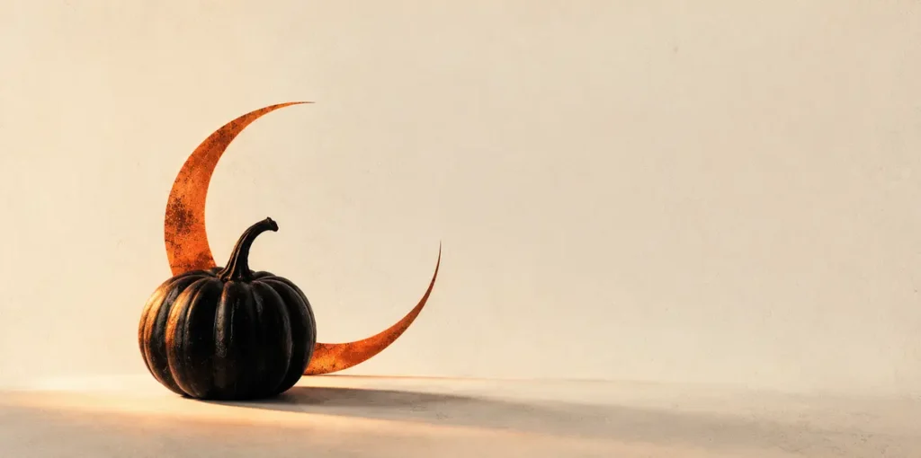
Minimalism can feel more premium than a crowded Halloween collage. Choose one recognizable symbol, such as a small bat, a single pumpkin, or a crescent moon, and give it plenty of negative space.
A restrained palette of black, warm ivory, and burnt orange can create an elegant seasonal look. Subtle paper textures and carefully balanced typography can add personality without distracting from the main idea.
This direction is particularly suitable for boutique campaigns, modern invitations, premium packaging, and editorial-style social media graphics.
11. Y2K Spooky Sticker Collage
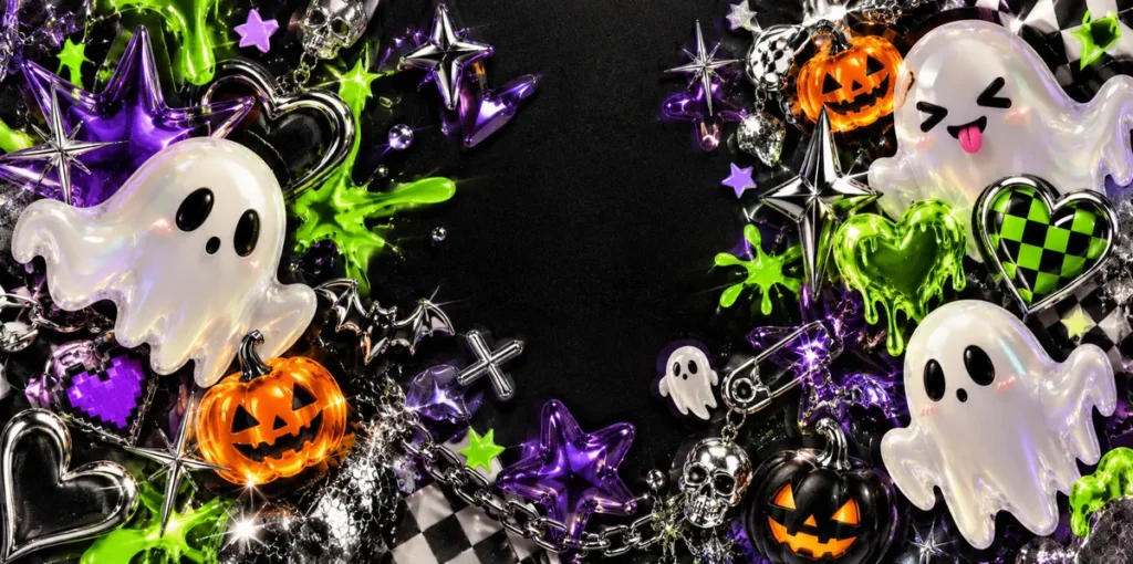
A Y2K-inspired Halloween collage can combine chrome stars, pixel hearts, mini ghosts, glossy pumpkins, and metallic effects. This playful digital aesthetic is ideal for sticker packs, creator merchandise, and energetic social media campaigns.
Choose a consistent set of motifs and repeat them across the design. Silver, violet, black, and slime green can help create a recognizable early-2000s-inspired palette.
To make the collage feel cohesive, vary the size of the elements and allow a few objects to overlap. Keep the main subject easy to identify so the composition does not become visually overwhelming.
12. Haunted Carnival Artwork
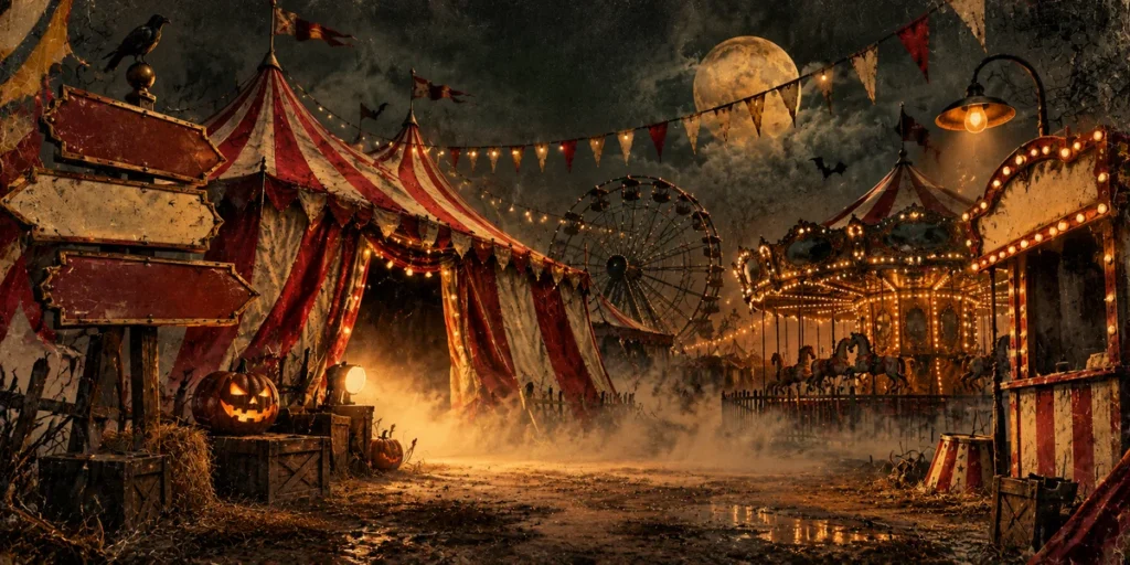
A haunted carnival gives designers plenty of opportunities to combine vintage entertainment imagery with eerie details. Striped tents, carousel silhouettes, funhouse mirrors, old ticket stubs, and drifting fog can establish a mysterious atmosphere.
Use faded red, mustard, cream, and black to create an aged poster aesthetic. Imperfect symmetry and distressed textures can make the artwork feel like an old carnival advertisement discovered in an abandoned building.
This concept works well for haunted attractions, escape rooms, Halloween festivals, and themed event promotions.
13. Spooky Food and Candy Graphic
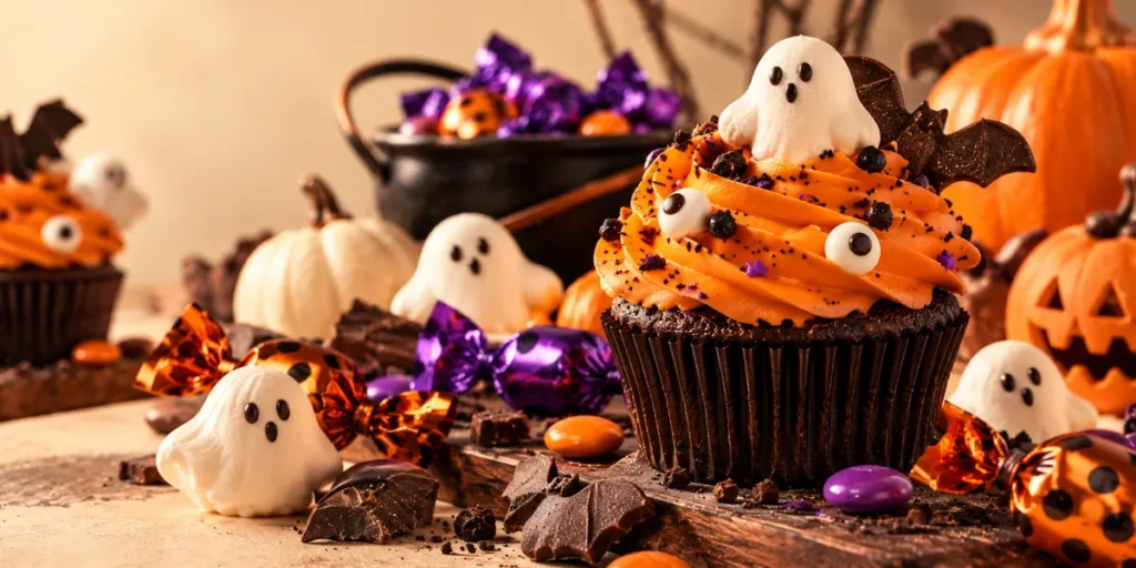
Candy, cupcakes, and seasonal drinks offer a lighter commercial direction for cafés, bakeries, and small businesses. Make the food the main character, then add a few Halloween details such as candy eyes, spiderweb icing, or ghost-shaped marshmallows.
Use warm lighting and appetizing colors to keep the imagery inviting. Orange, cream, cocoa, and purple can establish a recognizable seasonal palette without making the design too dark.
This concept is ideal for limited-edition menus, café promotions, bakery packaging, and social media announcements. Keep the food visually prominent so viewers understand the product immediately.
14. Social Media Carousel Cover
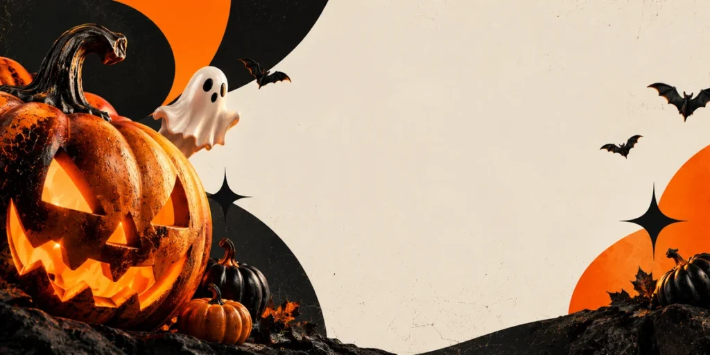
A carousel cover needs one clear focal point and a quick visual read on mobile. Combine an oversized seasonal object with a strong color block and leave enough room for a short headline.
Use the same palette, border treatment, and icon style throughout the following slides to create a cohesive visual identity. Each slide should introduce one idea, tip, or example rather than trying to communicate everything at once.
This approach is useful for Halloween design roundups, product showcases, seasonal tutorials, and promotional campaigns. A consistent visual system also makes it easier to repurpose the artwork for other platforms.
15. Mixed-Media Grunge Halloween Collage
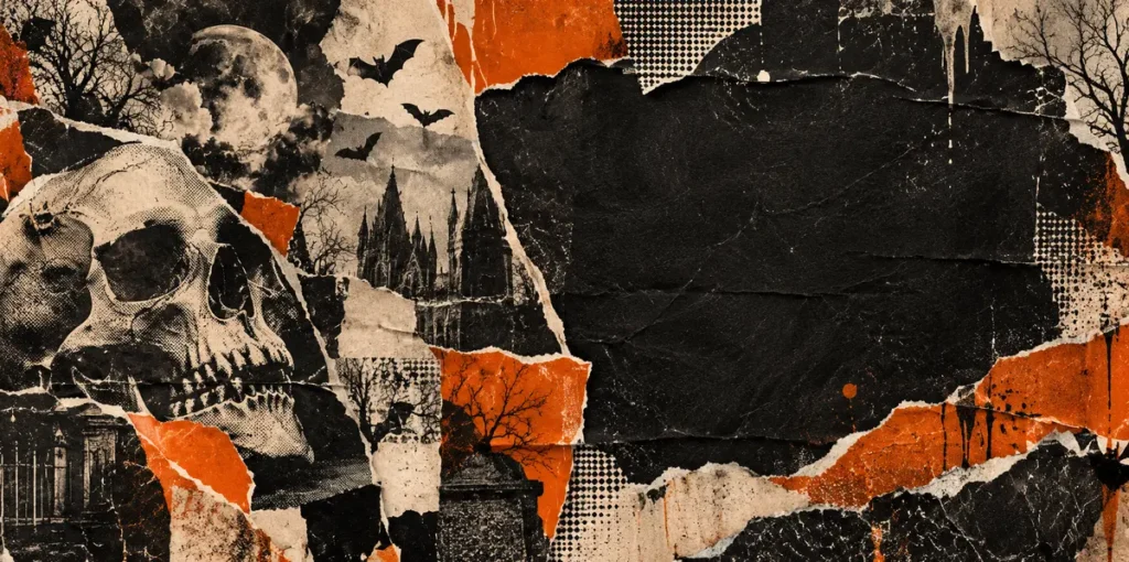
Mixed-media grunge combines torn paper, photocopy textures, rough ink, hand-drawn stars, and cutout shapes. The result feels expressive, imperfect, and influenced by independent zines and alternative music artwork.
Use a palette of black, cream, rust orange, and grey. Layer textures carefully and keep the main illustration sharp enough to stand out from the surrounding details.
This direction is a strong choice for independent fashion labels, alternative music events, underground party flyers, and creators who want an intentionally raw Halloween aesthetic.
More Halloween-Ready Fonts from Cikareotype
Typography can be the defining element of a Halloween design. The right display font helps establish whether a graphic feels frightening, playful, gritty, or experimental. In addition to choosing suitable illustrations and colors, consider the mood of the lettering before finalizing your design.
Here are seven more Cikareotype fonts worth exploring for Halloween-inspired artwork.
1. Death Subway – Raw Graffiti Drip Font
Death Subway is a relevant option for designers looking for raw graffiti lettering with a dripping aesthetic. Consider it for horror headlines, dark streetwear graphics, distressed posters, and urban Halloween campaigns.
2. Drop Shade – Melted 3D Graffiti Font
Melted and dimensional lettering can add visual depth to Halloween headlines. Drop Shade is worth considering for bold poster titles, sticker designs, and apparel graphics that need a more experimental appearance.
3. Meltdown Phantom – Dripping Handwritten Graffiti Font
For a more expressive direction, Meltdown Phantom can complement horror lettering, grunge compositions, and event flyers. Its handwritten graffiti aesthetic offers a different feel from traditional gothic display typography.
4. Toxic Rebel – Graffiti Font with Drips
Toxic Rebel is a suitable candidate for designs built around slime effects, monsters, and bold urban visuals. Experiment with high-contrast color combinations to create a striking seasonal graphic.
5. Gruze – Layered, Melted & Dripping Style Font
Layered and melted lettering can give Halloween artwork a more experimental appearance. Gruze is worth exploring for streetwear posters, sticker compositions, and mixed-media designs.
6. Grime Slime – Melted Graffiti with Toxic Flow
For a slime-inspired visual theme, Grime Slime can complement toxic-green palettes, monster illustrations, and dripping graphic elements. It is a useful style direction for designers who want to move beyond conventional Halloween lettering.
7. Melto Gofer – Bubble Graffiti Font
Halloween does not always need to look dark or frightening. Melto Gofer offers a playful bubble-graffiti direction that can complement cute ghosts, candy illustrations, cheerful seasonal graphics, and lighthearted social media content.
For more options, browse the Cikareotype freebies collection and explore additional typography on the Cikareotype website.
How to Make Your Halloween Design Work Across Platforms
Start with one master concept, then adapt the composition for each destination. Posters need clear information and strong viewing distance. T-shirts need a durable silhouette and print-friendly colors. Social graphics need an immediate focal point that survives a small mobile preview.
Rather than shrinking one layout into every format, reposition the illustration and rebuild the type hierarchy for each canvas. This helps preserve the impact of the design across different platforms.
For typography, reserve expressive horror lettering for short headlines and pair it with a simpler font for supporting details. Cikareotype’s Vuldra – A Halloween Font with Street Energy combines clean and melted styles, while Gorvex is an option for melting-inspired display lettering.
Before publishing, check contrast, spelling, crop safety, and whether the main idea reads clearly in a thumbnail. If you use stock assets or references, verify the source and usage terms. The Adobe Stock Contributor Resources provide a useful starting point for understanding stock content requirements.
Also Read: Discover more design inspiration on the Cikareotype Blog.
From Our Desk: Make the Spooky Style Your Own
The most memorable Halloween artwork usually starts with a specific point of view. Instead of adding every familiar symbol, choose one visual idea and push it further: a ghost with a fashion attitude, a pumpkin rendered like a luxury object, or horror lettering mixed with street graphics.
At Cikareotype, expressive display typography can become the anchor that ties posters, apparel, and digital content together. Treat these design ideas as starting points, not fixed rules. Adjust the palette, details, and composition to fit the audience and the story your design needs to tell.
For more Halloween-ready typography, explore Antiink, Gorvex, and Vuldra. You can also visit the Cikareotype freebies collection to discover additional design resources.
Conclusion
These 20 Halloween design ideas cover classic horror, playful characters, retro apparel, gothic details, neon party graphics, and modern mixed-media styles. Choose the direction that matches your audience, keep the visual hierarchy clear, and adapt each composition to its final format.
Strong typography and a focused concept can turn a familiar Halloween theme into a design people remember and want to share. Whether you are creating a party poster, a streetwear graphic, or a social media campaign, thoughtful choices in color, lettering, and composition can help your work stand out.
Ready to build your next spooky campaign? Explore Cikareotype’s Gorvex melting Halloween graffiti font, Antiink horror brush font, Vuldra Halloween font, and freebies collection.
Also Read: Explore more articles on the Cikareotype Blog.