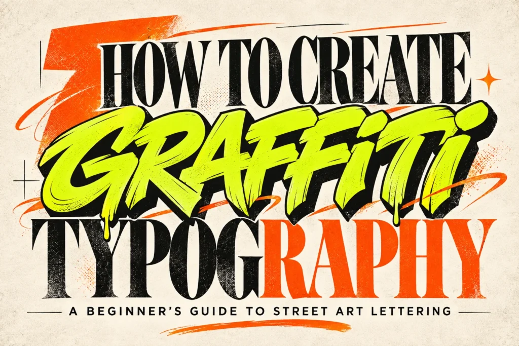
How to Create Graffiti Typography: A Beginner’s Guide to Street Art Lettering
Graffiti typography is one of the most expressive styles in graphic design. Known for its energetic lettering, bold outlines, dynamic shapes, and vibrant colors, it brings a distinctive street-inspired personality to posters, clothing graphics, logos, and digital artwork.
Unlike conventional typography, graffiti lettering gives designers more freedom to experiment with letter shapes, proportions, connections, and decorative effects. A simple word can become an elaborate visual composition through creative lettering techniques and carefully applied details.
If you are a graffiti enthusiast, illustrator, or streetwear designer, learning how to create graffiti typography can help you develop a more distinctive visual style. You do not need to be an experienced graffiti artist to get started. With a basic understanding of letter construction, outlines, shadows, and color combinations, you can begin creating your own street art-inspired designs.
In this beginner’s guide, we will explore the essential techniques for creating graffiti typography, from choosing your lettering style to adding the finishing effects that make your artwork stand out.
1. Understand Different Graffiti Lettering Styles
Before creating graffiti typography, it is important to understand that graffiti lettering comes in many different styles. Each approach has its own visual characteristics, level of complexity, and personality.
Starting with a style that matches your creative direction will make the design process easier.
Bubble Letters
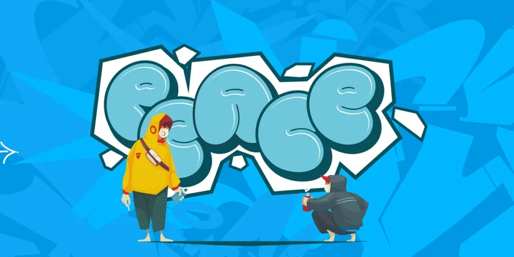
Bubble letters are among the easiest graffiti styles for beginners to explore. They use rounded, inflated letterforms with soft corners and thick shapes.
This style often feels playful, friendly, and energetic. It works well for colorful posters, stickers, merchandise graphics, and youth-oriented streetwear designs.
Design tip: Start by drawing simple uppercase letters using rounded shapes. Keep the thickness consistent and leave enough space between characters.
Explore : Vandal Blow – Bubble Graffiti Font
Block Letters
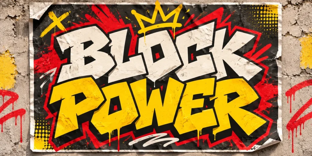
Block lettering uses thick, structured characters with strong geometric shapes. The letters are generally easier to read than more complicated graffiti styles, making them a useful starting point.
This approach works particularly well for bold headlines, streetwear graphics, promotional posters, and typography-based logos.
Design tip: Begin with basic rectangular letter structures, then experiment with wider proportions, angled edges, and slightly irregular shapes.
Wildstyle Lettering
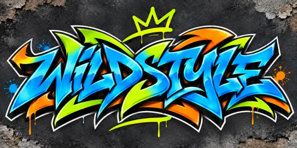
Wildstyle is a more complex graffiti approach that features interlocking letters, arrows, extensions, connections, and decorative elements.
The characters often overlap and become highly stylized, creating an intricate composition. Although wildstyle can look impressive, it requires more practice because readability is often less straightforward.
Design tip: Learn to construct simple block letters first. Gradually introduce connections, extensions, and overlapping shapes instead of adding too many details immediately.
Dripping Graffiti Letters
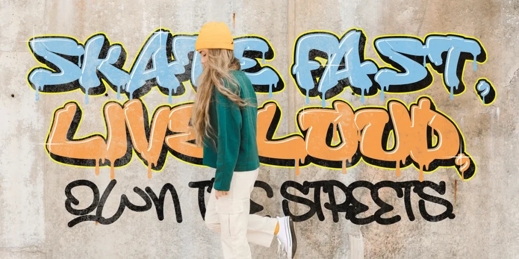
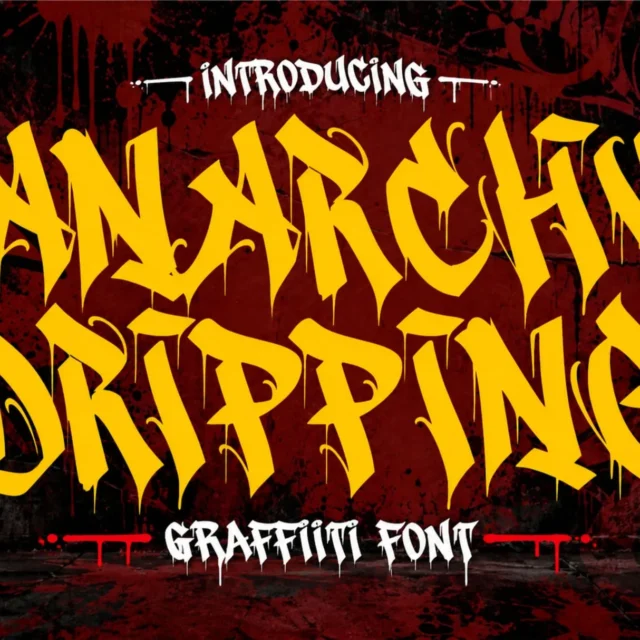
Dripping graffiti lettering features paint-like extensions that appear to flow downward from the characters. These effects create a raw, expressive appearance associated with spray paint and street art aesthetics.
Dripping effects can be used with bubble letters, block lettering, or more experimental display styles.
Design tip: Add a few controlled drips to selected parts of the letters. Avoid applying the same dripping effect everywhere, as this can make the composition look crowded.
2. Sketch Your Letter Shapes
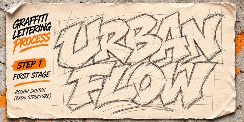
Once you have selected a lettering style, the next step is constructing the basic shapes of your letters.
A strong graffiti design begins with a recognizable structure. Even when the final result includes unusual proportions, overlapping elements, and decorative extensions, the original letters should provide a clear foundation.
Start with a short word or name. Short words are easier to arrange and allow you to focus on individual letterforms.
Build the Basic Structure
Draw each character using simple geometric shapes. You can use circles for rounded letters, rectangles for block-style characters, and diagonal lines for more dynamic structures.
At this stage, do not worry about colors or decorative effects. Focus on the overall proportions and spacing.
Experiment with Letter Proportions
Graffiti lettering does not always follow standard typography proportions. You can make letters wider, taller, narrower, or more angular to create a distinctive visual rhythm.
For example, stretching the first and last characters can create a more dramatic composition. Meanwhile, slightly overlapping neighboring letters can make the word feel connected.
Connect the Characters
Some graffiti styles use connected letterforms to create a continuous composition.
Try adjusting the position of individual characters until they feel visually balanced. However, make sure the letters do not become difficult to distinguish.
Beginner tip: Use pencil sketches or digital rough shapes before refining the final artwork. It is much easier to adjust proportions at this stage than after adding outlines and effects.
3. Add Bold Outlines to Define Your Letters
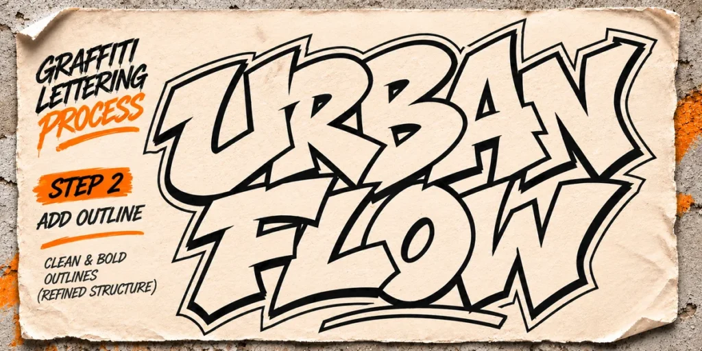
Outlines are one of the most recognizable features of graffiti typography. They separate the letterforms from the background, strengthen their visual structure, and make the composition feel more complete.
A typical graffiti design may use several outline layers to create a bold, dimensional appearance.
Create the Main Outline
Start by adding a thick outline around each letter. This defines the overall shape and separates the lettering from other elements.
Black is a popular choice because it creates strong contrast, but dark navy, deep purple, and other saturated colors can also work.
Add a Secondary Outline
A second outline can create additional depth and make the lettering appear more decorative.
For example, you can place a thin white or bright-colored border outside the main black outline. This technique works especially well when the poster uses a dark or textured background.
Keep the Outline Consistent
Although graffiti styles can be irregular, outline thickness should feel intentional.
If some characters have extremely thick outlines while others have very thin borders, the composition may lose visual balance.
Design tip: Experiment with two or three outline layers, but make sure each layer has a clear purpose. The main outline should define the letters, while secondary outlines should enhance their separation and appearance.
4. Create Depth with Shadows and 3D Effects
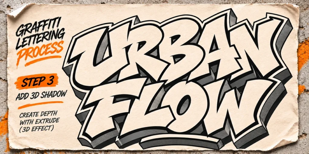
Shadows can transform flat graffiti lettering into a more dimensional composition. They create the illusion that the letters are raised from the background or extending into space.
This technique is particularly useful for streetwear graphics, event posters, and bold promotional artwork.
Drop Shadows
A drop shadow is one of the simplest ways to add depth. Duplicate the lettering, move the copy slightly in one direction, and place it behind the original characters.
You can use black for a subtle shadow or a contrasting color for a more expressive effect.
Extruded Shadows
Extruded shadows extend the letterforms in a consistent direction, creating the appearance of three-dimensional lettering.
For example, a bright orange word with a dark red extrusion can produce a strong retro street art aesthetic.
Perspective Effects
You can also experiment with perspective by making the shadow appear longer or wider as it extends away from the letters.
This creates a more dynamic result, especially when combined with angled lettering.
Design tip: Choose one consistent light or extrusion direction. If the shadows point in different directions, the design may feel visually confusing.
5. Choose Bold and Vibrant Color Combinations
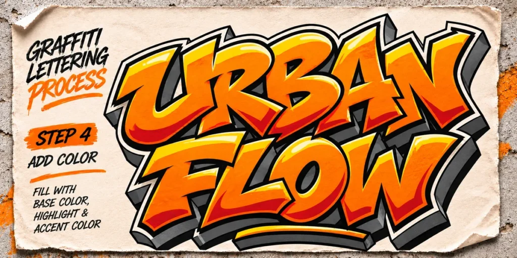
Color plays a major role in graffiti typography. The right combination can make lettering feel energetic, aggressive, playful, futuristic, or nostalgic.
However, using many bright colors does not automatically create a strong design. Good color selection depends on contrast, balance, and the visual personality you want to communicate.
Here are several combinations worth experimenting with.
Neon and Black
Neon green, electric blue, vivid pink, or bright orange against black creates a strong urban atmosphere.
This combination works particularly well for nightlife posters, streetwear graphics, and energetic promotional designs.
Red, Yellow, and Black
These colors produce a bold, attention-grabbing appearance. They are useful for aggressive lettering, skate-inspired graphics, and expressive street art compositions.
Purple and Electric Blue
Purple and electric blue can create a futuristic visual direction. Add white highlights or darker outlines to make the letterforms more defined.
Orange, Cream, and Brown
For a warmer vintage street art aesthetic, combine burnt orange with cream and dark brown. This palette works well with retro lettering and distressed print textures.
Use Color with a Clear Hierarchy
A practical approach is to select three main colors:
- Primary color: The main fill color of the letters.
- Secondary color: Used for shadows, highlights, or dimensional effects.
- Outline color: Separates the lettering from the background.
This simple system helps maintain consistency even when the design contains multiple decorative details.
6. Add Dripping Effects and Street Art Details
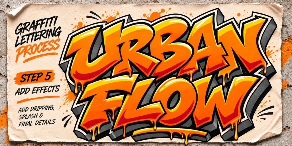
Dripping effects can give graffiti typography a raw, expressive appearance. They make letters look as though they have been painted with liquid ink or spray paint.
Although dripping is a popular visual treatment, it should complement the letterforms rather than overwhelm them.
Create Natural Paint Drips
Start by identifying areas where paint could naturally appear to flow downward from the lettering. Add a few elongated shapes extending from the lower edges of selected characters.
Vary their length and thickness to create a more natural appearance.
Add Highlights and Shadows
Small highlights can make the drips appear glossy or wet. Meanwhile, darker edges and shadows can give them more visual weight.
Use these details selectively to avoid making the lettering too complicated.
Include Supporting Street Art Elements
You can strengthen the street-inspired atmosphere with additional graphic details, such as:
- Paint splashes and scattered droplets.
- Marker strokes and hand-drawn lines.
- Small arrows and decorative extensions.
- Rough textures and distressed surfaces.
- Halftone patterns and photocopy effects.
Design tip: Keep the main word as the focal point. Supporting elements should reinforce the composition without competing with the lettering.
If you want to explore ready-made dripping lettering, Junky Style – Dripping Graffiti Font is a useful Cikareotype option for projects that need an expressive urban appearance. You can also explore Death Subway – Raw Graffiti Drip Font for a darker, more aggressive lettering direction.
7. Refine Your Composition and Background
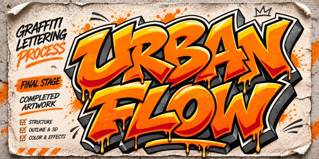
After developing the letterforms and adding their visual effects, take time to refine the complete composition.
A good graffiti typography design needs more than impressive letters. The background, spacing, supporting graphics, and overall balance also influence how the final artwork looks.
Choose a Background That Supports the Lettering
Concrete walls, distressed paper, dark textures, and rough surfaces are common choices for street art-inspired designs.
However, a clean background can also work when the lettering already contains enough visual detail.
Control the Visual Hierarchy
Make sure the main word attracts attention first. Supporting text, decorative graphics, and smaller details should remain secondary.
Check Spacing and Balance
Look at the distance between characters and the space around the entire word. Adjust individual letters if the composition feels too heavy on one side.
Test Different Applications
Your graffiti typography might eventually appear on a poster, T-shirt, hoodie, skateboard, sticker, or digital campaign.
Preview the artwork in its intended application to check whether the lettering remains clear and visually effective.
Using Graffiti Fonts to Speed Up Your Design Process
Creating graffiti lettering from scratch is a valuable way to develop your drawing skills. However, not every project requires you to construct every character manually.
Ready-made graffiti fonts can help you explore different lettering styles more efficiently. They provide a foundation that you can customize with outlines, shadows, color treatments, textures, and additional graphic elements.
Cikareotype offers several graffiti-inspired typefaces that can help you experiment with different visual directions.
Junky Style – Dripping Graffiti Font
Junky Style is suitable for expressive urban designs that need dripping details and playful graffiti character.
Death Subway – Raw Graffiti Drip Font
Death Subway offers a rawer visual direction for darker street art concepts, bold posters, and alternative graphic designs.
Wolf Fangs – Edgy Graffiti Display Font
Wolf Fangs is another option for projects that need strong, unconventional display lettering.
Koobang – Monoline Graffiti Tag Font
Koobang offers a different approach through monoline graffiti-inspired lettering, making it useful when you want a tag-like appearance.
You can discover more options through the Cikareotype font collection.
Remember that a font is only a starting point. You can still customize its appearance through your own color choices, outlines, shadows, textures, and composition techniques.
Common Mistakes to Avoid When Creating Graffiti Typography
Beginners often focus too much on decorative effects before establishing the basic lettering structure. As a result, the final design may look complicated but lack a clear visual direction.
Here are several mistakes worth avoiding:
- Adding too many effects: Excessive shadows, outlines, gradients, and drips can make the letters difficult to distinguish.
- Ignoring letter structure: Decorative details cannot compensate for poorly constructed characters.
- Using too many colors: A crowded color palette can weaken the visual hierarchy.
- Making every letter identical: Some variation in shape and proportion can create a more expressive composition.
- Forgetting readability: Even experimental graffiti lettering should communicate its intended message when readability is important.
- Neglecting the background: A background that competes with the lettering can reduce the impact of the entire design.
The best way to improve is to practice one technique at a time. Start with simple block letters, then gradually introduce outlines, shadows, color combinations, and decorative effects.
From Our Desk: Develop Your Own Graffiti Lettering Style
At Cikareotype, we see graffiti typography as a creative space where lettering and visual expression come together. The most interesting designs are not always the most complicated ones. Sometimes, a simple word with distinctive proportions, strong outlines, and a thoughtful color combination can create a much stronger impression.
If you are just starting, do not feel pressured to master wildstyle or advanced effects immediately. Explore different letter structures, study how shapes connect, and experiment with small changes to your outlines and shadows.
You can also use ready-made graffiti fonts as creative starting points. Customize them, combine them with your own graphic elements, and gradually develop a visual language that feels unique to your work.
Most importantly, keep practicing. Every experiment helps you understand how lettering, composition, and visual effects work together.
Final Thoughts
Learning how to create graffiti typography is a rewarding process for anyone interested in street art, illustration, and graphic design. From selecting letter styles and constructing basic shapes to adding bold outlines, dimensional shadows, vibrant colors, and dripping effects, every technique contributes to the personality of the final artwork.
Start with simple lettering, develop your understanding of structure, and gradually experiment with more expressive treatments. Whether you draw every character yourself or use a graffiti font as your starting point, the goal is to create typography that communicates a strong visual identity.
Ready to explore more street-inspired lettering? Discover the Cikareotype graffiti and display font collection and find the right typeface for your next creative project.