Typography is more than a way to communicate words. In graphic design, letters can become illustrations, textures, patterns, and powerful visual elements that define an entire composition. A well-designed poster does not always need complicated graphics or decorative illustrations. Sometimes, the right typeface, thoughtful spacing, and creative arrangement are enough to create a memorable visual experience.
For graphic designers, freelance creatives, and typography enthusiasts, exploring different typography poster ideas is a great way to develop new visual directions. From oversized headlines and dimensional lettering to nostalgic layouts and expressive graffiti styles, each approach offers a different way to transform ordinary text into eye-catching artwork.
In this article, we explore seven creative typography poster concepts that can inspire your next project. Each style includes practical design tips to help you experiment with letterforms, colors, composition, and visual hierarchy.
1. Oversized Bold Typography
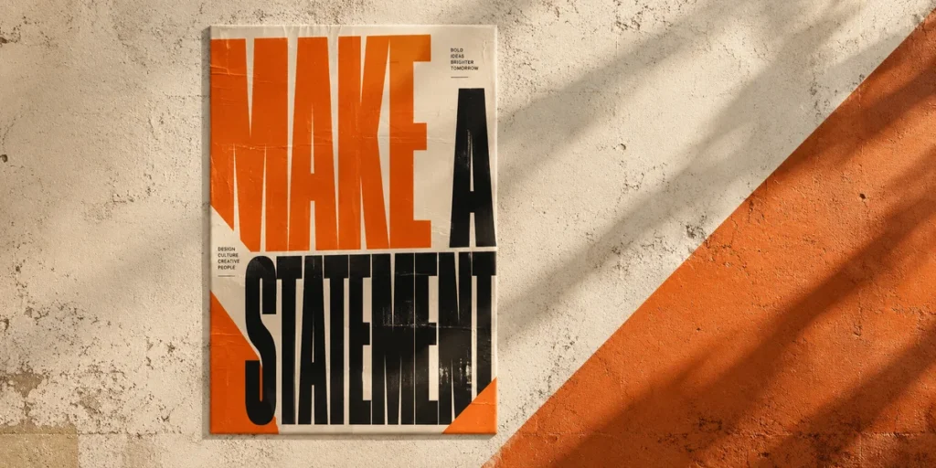
One of the most effective typography poster ideas is using oversized lettering as the main visual element. Instead of treating text as supporting information, this approach makes the headline the centerpiece of the entire composition.
Large typography immediately attracts attention, especially when the letters occupy most of the poster space. Designers often use bold, heavy, or condensed display typefaces to create a strong visual statement. Some letters can even extend beyond the edges of the canvas, creating an intentional cropped effect.
This technique works particularly well for music events, fashion campaigns, streetwear promotions, motivational posters, and editorial designs. For example, a poster featuring the word “CREATE” in enormous condensed lettering can communicate energy and confidence without requiring additional illustrations.
How to Create the Look
- Choose a bold or condensed display typeface.
- Make the headline significantly larger than supporting information.
- Experiment with cropped letters that extend beyond the poster edges.
- Use strong color contrast to improve visibility.
- Keep secondary elements minimal to maintain focus.
The key is to balance dramatic scale with readability. Even when the headline is intentionally cropped, the overall word should remain recognizable.
For this style, explore bold display typefaces from the Cikareotype font collection to find expressive lettering suitable for impactful poster compositions.
2. 3D and Extruded Typography
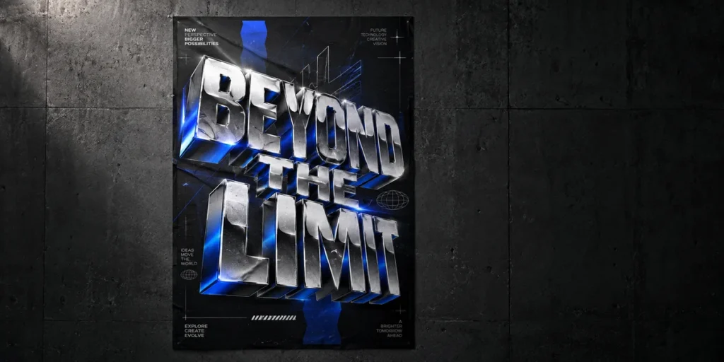
3D typography introduces depth and dimension to traditional lettering. By adding extrusion, shadows, perspective, and lighting effects, designers can make flat text appear as though it exists in physical space.
Unlike standard typography, dimensional lettering creates a stronger sense of movement and visual depth. The letters can appear to project forward, extend backward, float above the background, or interact with other graphic elements.
This approach is popular for futuristic posters, technology events, gaming promotions, music artwork, and experimental editorial layouts. Metallic surfaces, glossy finishes, colorful gradients, and dramatic shadows can make the composition feel more immersive.
For example, a poster with a large chrome headline against a dark background can create a futuristic atmosphere. Meanwhile, colorful extruded lettering can produce a playful and energetic visual direction.
How to Create the Look
- Start with a heavy display typeface that has enough visual weight.
- Apply extrusion effects in a consistent direction.
- Experiment with perspective and shadow depth.
- Use lighting to emphasize the dimensional surfaces.
- Choose contrasting background colors to make the lettering stand out.
Although 3D effects can make a poster visually impressive, avoid adding too many effects at once. The headline should remain the most recognizable element.
A heavy display font is a useful starting point because thicker letterforms provide more surface area for dimensional treatments.
3. Retro and Vintage Typography
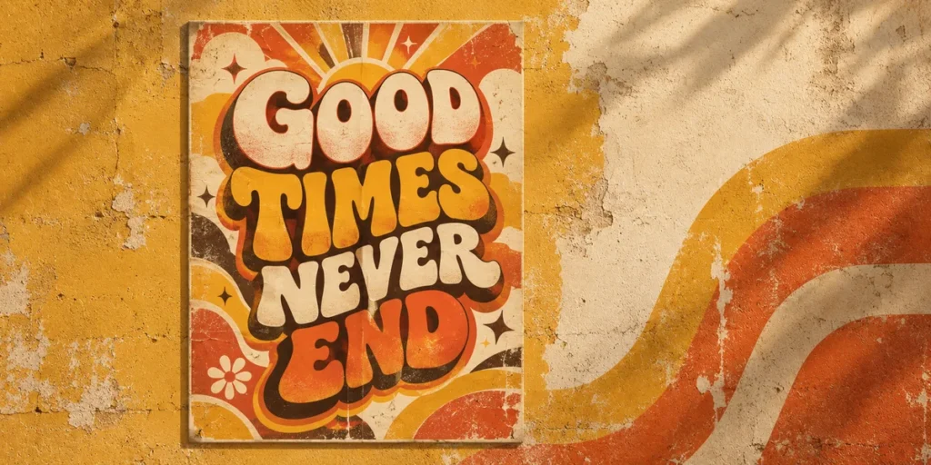
Retro and vintage typography posters bring nostalgic visual character into modern graphic design. Inspired by the visual language of the 1970s, 1980s, and 1990s, this style often features expressive lettering, warm color combinations, decorative shadows, and textured surfaces.
Common characteristics include chunky display fonts, rounded letterforms, curved text arrangements, layered shadows, and vintage-inspired print effects. These elements help create a distinctive atmosphere that feels playful, nostalgic, and full of personality.
Color also plays an important role. Burnt orange, mustard yellow, cream, dark brown, faded red, and muted green are useful choices for creating a vintage-inspired palette. However, brighter combinations can also work when referencing more energetic 1980s and 1990s aesthetics.
Retro typography works well for music posters, clothing campaigns, coffee shop branding, festival promotions, and nostalgic product advertisements.
How to Create the Look
- Select expressive retro display fonts with distinctive letterforms.
- Experiment with curved headlines and decorative lettering.
- Add offset shadows or layered color treatments.
- Use a limited palette inspired by vintage print design.
- Apply subtle grain or paper textures for additional character.
The most important part is maintaining consistency. Combining retro lettering with appropriate colors, textures, and graphic elements helps the poster feel intentional rather than randomly decorated.
For projects that need a strong retro appearance, explore Paradisea – Elegant Vintage Serif Font. Its shadow-inspired lettering can complement bold vintage compositions and expressive poster headlines.
4. Experimental and Distorted Typography
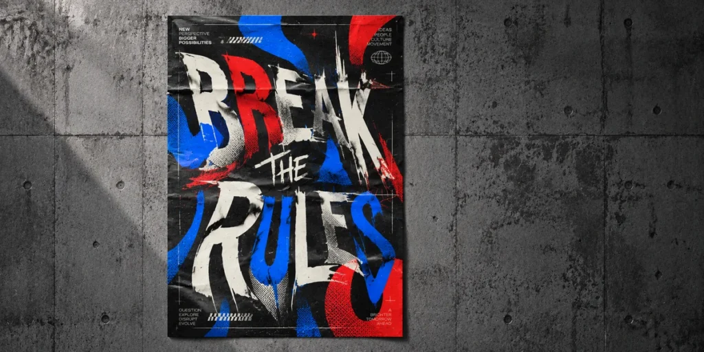
Experimental typography challenges traditional rules of letter arrangement and visual presentation. Instead of keeping every character perfectly aligned, designers manipulate letterforms through stretching, warping, fragmentation, unusual proportions, and unexpected spacing.
This approach is particularly useful when a poster needs a distinctive artistic identity. Distorted typography can communicate movement, tension, emotion, and unconventional creative expression.
For example, a music poster might feature stretched letters that appear to vibrate across the composition. An experimental art exhibition poster could use fragmented characters, overlapping shapes, and irregular spacing to create a more abstract visual experience.
However, experimental design does not mean sacrificing every aspect of readability. The headline should still communicate its intended message, even if some supporting text is treated more creatively.
How to Create the Look
- Experiment with stretched, compressed, or warped letterforms.
- Adjust character spacing to create unusual visual rhythms.
- Combine regular and distorted typography.
- Use asymmetrical arrangements to introduce movement.
- Maintain a clear focal point within the composition.
One useful technique is to manipulate only selected characters rather than distorting the entire headline. This creates visual contrast while preserving the overall structure of the word.
For a more unconventional result, start with an expressive display typeface and experiment with additional effects in your preferred design software.
5. Layered and Overlapping Typography
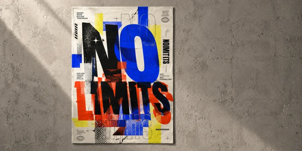
Layered typography creates visual depth by placing multiple typographic elements within the same composition. Instead of presenting a single headline on a flat background, this approach uses overlapping words, repeated letterforms, outlines, shadows, and contrasting text layers.
The result can feel dynamic and energetic because the different layers interact with one another. Some text elements appear closer to the viewer, while others seem to sit behind the main headline.
This style is particularly effective for music posters, streetwear graphics, promotional campaigns, and creative event announcements. Designers can combine different font weights, sizes, and colors to build a composition that feels visually rich without relying on excessive illustrations.
For example, a poster might feature a large solid headline in the foreground, a repeated outlined version behind it, and smaller supporting text positioned between the layers. This arrangement creates movement while establishing a clear typographic hierarchy.
How to Create the Look
- Begin with one dominant headline.
- Add secondary text or repeated letterforms behind the main typography.
- Combine solid lettering with outlines or shadow effects.
- Use contrasting colors to separate the different layers.
- Control transparency and spacing to prevent visual clutter.
The secret to successful layered typography is hierarchy. Every text element should have a purpose, and the main message must remain easy to identify.
For dimensional and layered lettering, Gruze – Layered, Melted & Dripping Style Font offers an expressive starting point for experimental compositions and bold display treatments.
6. Minimalist Typography Posters
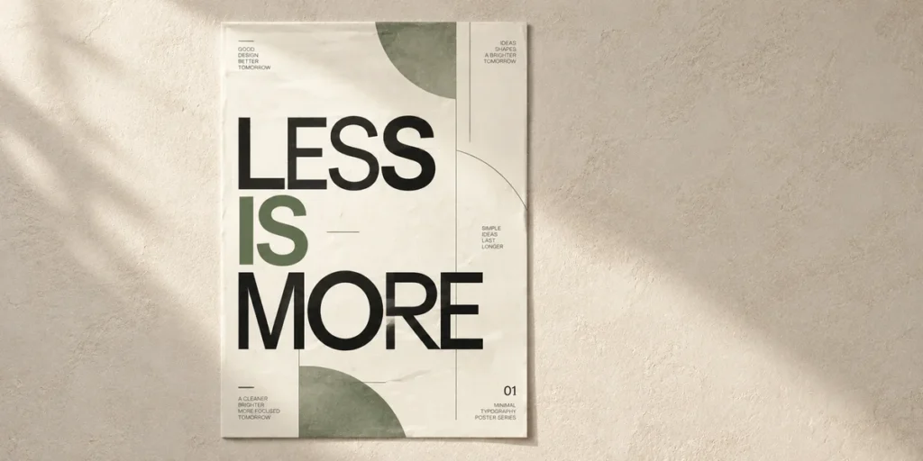
Minimalist typography posters demonstrate that a strong design does not always require complicated visual effects. By using a limited number of words, generous negative space, and carefully selected typefaces, designers can create compositions that feel clean, balanced, and sophisticated.
This approach focuses on the relationship between typography and empty space. Every letter, line, and alignment decision becomes important because there are fewer decorative elements competing for attention.
Minimalist posters are commonly used for art exhibitions, architecture events, editorial campaigns, product promotions, and modern branding projects. They can also communicate powerful messages through a single word or a short statement.
For example, a poster featuring the word “LESS” in a clean sans serif typeface, positioned slightly above the center of a plain background, can create a clear visual statement through simplicity alone.
How to Create the Look
- Limit the composition to one or two typefaces.
- Use generous negative space around the main headline.
- Pay attention to alignment, margins, and letter spacing.
- Choose a restrained color palette.
- Remove decorative elements that do not support the message.
Minimalism requires careful decision-making. Since the design contains fewer elements, inconsistent spacing or poorly chosen typography becomes more noticeable.
Rather than adding unnecessary effects, focus on the details that make the composition feel balanced. A carefully selected typeface, precise kerning, and thoughtful alignment can make a simple poster visually compelling.
7. Expressive Graffiti and Street Art Typography
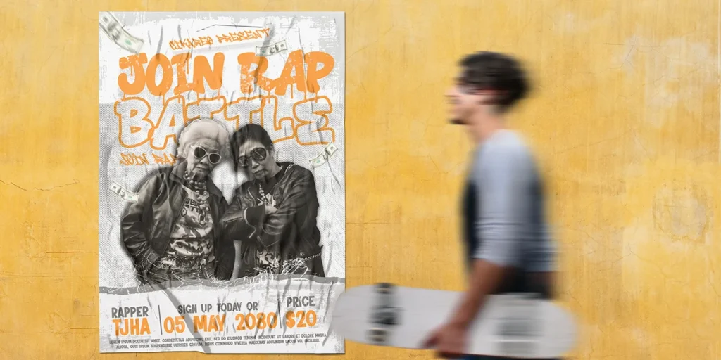
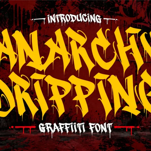
Graffiti and street art typography bring energy, individuality, and urban character into poster design. Inspired by graffiti lettering and street culture, this approach often features expressive letterforms, dripping effects, marker strokes, bold outlines, and dynamic compositions.
Unlike minimalist typography, graffiti-inspired designs usually embrace visual complexity and unconventional lettering. The characters may overlap, stretch, twist, or connect to create a distinctive visual identity.
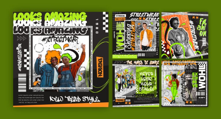
This style is especially suitable for streetwear campaigns, hip-hop events, skateboarding promotions, underground music posters, and youth-oriented branding. Strong colors such as neon green, electric blue, bright red, and vivid orange can help reinforce its energetic personality.
Graffiti typography can also become the central illustration of a poster. Instead of adding a separate graphic, designers can use the lettering itself to communicate the theme and atmosphere.
How to Create the Look
- Choose expressive graffiti or street art display fonts.
- Experiment with dripping effects, bold outlines, and marker-inspired details.
- Use strong color combinations to create visual contrast.
- Arrange letters dynamically without losing the main message.
- Add supporting elements such as rough textures, paint marks, or urban-inspired graphics.
For this style, typography selection makes a significant difference. Consider exploring these Cikareotype fonts:
- Toxic Rebel – Dripping Graffiti Font for playful dripping lettering and urban compositions.
- Death Subway – Raw Graffiti Drip Font for darker and more aggressive visual directions.
- Wolf Fangs – Edgy Graffiti Display Font for bold and unconventional streetwear graphics.
Choose a lettering style that matches the message rather than using every available effect. A well-organized graffiti poster can be expressive while remaining visually clear.
How to Choose the Right Font for a Typography Poster
Choosing the right typeface is one of the most important decisions in typography poster design. A font influences how the message feels, how quickly it can be understood, and how the entire composition is perceived.
Before selecting a typeface, consider the following factors:
1. Define the Message and Visual Direction
Start by understanding the purpose of your poster. Is it promoting a music event, announcing an exhibition, advertising a product, or communicating an inspirational message?
A futuristic display font may suit a technology event, while expressive retro lettering may be more appropriate for a vintage-inspired campaign. The typeface should support the message rather than distract from it.
2. Match the Font to the Intended Mood
Different type styles communicate different personalities. Bold display fonts often feel powerful, serif typefaces can create an editorial atmosphere, and graffiti lettering brings a more rebellious character.
Think about the emotion you want the audience to experience before choosing the font.
3. Consider Readability and Viewing Distance
Posters are often viewed from a distance, so the main headline should be easy to recognize. Pay attention to letter shapes, spacing, contrast, and text size.
Decorative fonts can work beautifully for short headlines, but smaller supporting information usually benefits from simpler typefaces.
4. Create Contrast Between Headlines and Supporting Text
A clear difference between the main headline and secondary information helps guide the viewer’s attention. You can create contrast through font size, weight, style, or color.
For example, pair a heavy display headline with a clean sans serif typeface for dates, locations, and other details.
5. Avoid Using Too Many Typefaces
Combining too many unrelated fonts can make a poster feel inconsistent. In most cases, one or two complementary typefaces are enough to create a strong visual hierarchy.
If you want more ideas for combining different type styles, explore our guide to 15 Font Pairing Ideas That Make Any Design Look More Professional.
Tips for Creating Better Typography Posters
Once you have selected your typeface and visual direction, the next step is refining the composition. Small adjustments can make a significant difference in the final result.
Here are practical recommendations to improve your typography poster designs:
- Establish a clear visual hierarchy: Make the most important message the first element viewers notice. Use size, weight, and placement to organize the information.
- Experiment with scale and proportions: Try oversized headlines, narrow lettering, or unusual character arrangements to create visual interest.
- Use color contrast strategically: Select colors that help separate the headline from the background and supporting elements.
- Pay attention to kerning and letter spacing: Adjust the space between individual characters to improve balance and visual consistency.
- Create balanced compositions: Distribute visual weight carefully, especially when using oversized or overlapping typography.
- Test the design at its actual viewing size: Check whether the headline and essential information remain readable when the poster is viewed from a realistic distance.
Additionally, study how other designers use typography in editorial layouts, advertising, and event posters. Observing different approaches can help you discover new creative possibilities without simply copying existing compositions.
For more visual inspiration, you can also read 10 Graphic Design Trends You Need to Know in 2026.
From Our Desk: Let Typography Lead the Design
At Cikareotype, we believe typography should be more than a finishing touch. The right letterforms can become the foundation of an entire visual concept.
When creating a typography poster, do not be afraid to experiment. Try combining unusual proportions, unexpected colors, expressive display fonts, and different composition techniques. Sometimes, the most interesting results come from exploring a typeface beyond its conventional use.
However, always remember that creative experimentation needs direction. A successful poster should have a clear focal point, a meaningful visual hierarchy, and a strong connection between its typography and message.
Explore different lettering styles, test new combinations, and allow the character of each typeface to influence your creative process.
Final Thoughts
These seven typography poster ideas demonstrate how lettering can transform a simple message into a memorable visual experience. Whether you prefer oversized headlines, dimensional effects, vintage aesthetics, experimental compositions, minimal layouts, or expressive graffiti styles, each approach offers a different opportunity to explore creative typography design.
The best results often come from understanding the message first and then choosing a typographic direction that supports it. Experiment with scale, spacing, color, texture, and letterforms until the composition feels balanced and distinctive.
If you are looking for expressive display fonts to support your next project, explore the Cikareotype font collection and discover lettering styles that can bring your creative ideas to life.
Keep experimenting, trust your visual instincts, and let typography become the main character of your next poster design.