Introduction
Graphic design in 2026 is becoming more expressive, tactile, and personal. While digital tools continue to make polished visuals easier to produce, designers are exploring rough textures, unconventional typography, retro influences, and imperfect details to create work with a stronger identity. The goal is no longer simply to make a design look clean. It is to make it memorable.
For graphic designers, freelancers, brand owners, and content creators, understanding the graphic design trends of 2026 can help turn creative ideas into more distinctive visual experiences. From experimental typography to streetwear-inspired graphics, these trends offer practical inspiration for branding, posters, packaging, apparel, and social media campaigns.
At Cikareotype, we believe typography can be more than a supporting element. A distinctive typeface can become the visual identity of an entire project. Here are 10 graphic design trends worth exploring in 2026, along with practical ways to apply them to your next creative project.
1. Expressive Typography Takes Center Stage
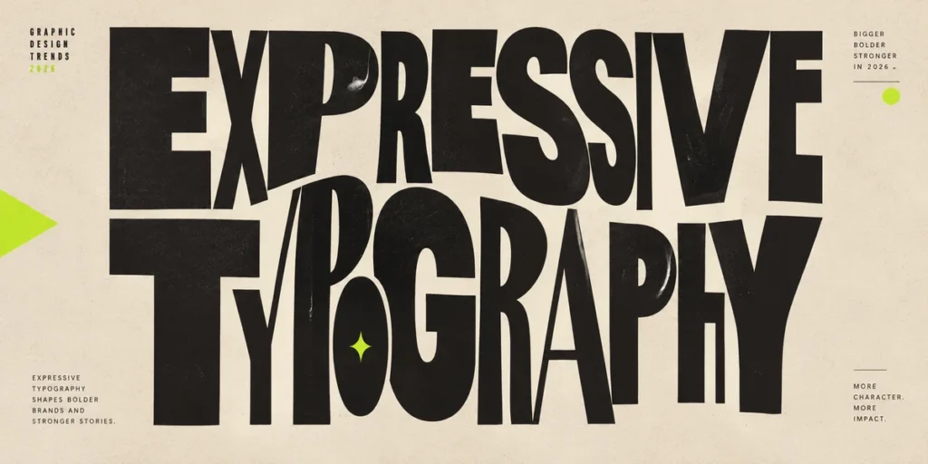
Typography is becoming one of the strongest visual elements in contemporary graphic design. Instead of treating text as information that sits alongside an image, designers are turning letterforms into the main attraction.
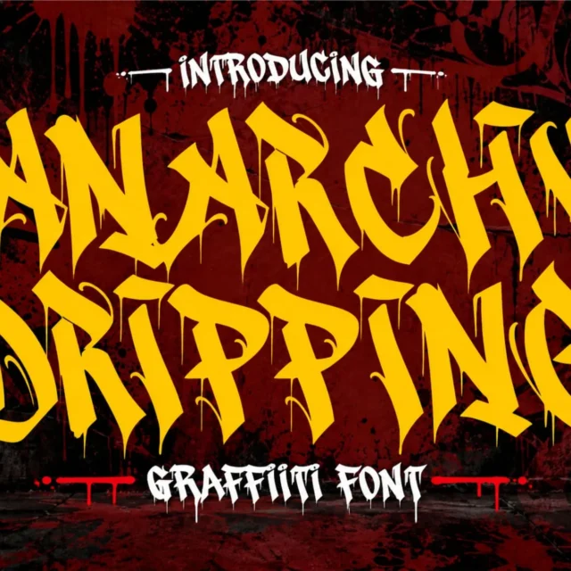
Oversized headlines, unusual proportions, chunky lettering, distorted characters, and expressive display fonts can give a composition an immediate personality. This approach is especially effective for music artwork, event posters, streetwear graphics, packaging, and social media campaigns.
The key is to make expressive typography purposeful. A headline should attract attention while remaining readable. Supporting text can use a simpler typeface to establish hierarchy and keep the overall layout balanced.
Also Read: Best Graffiti Fonts for Social Media: How to Boost Your Brand Aesthetics.
2. Tactile Textures and Imperfect Finishes
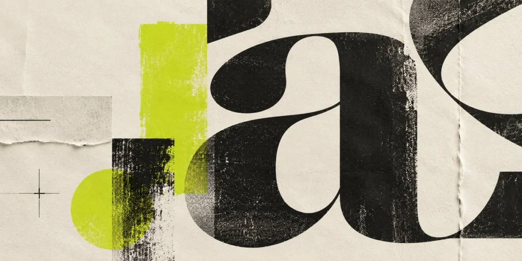
Perfectly smooth graphics are no longer the only way to create a professional-looking design. Grain, paper fibers, rough ink, scratches, fabric textures, and hand-drawn marks can introduce a sense of material and personality.
These details make digital artwork feel closer to something physical. A poster can resemble a screen-printed piece, a brand identity can incorporate handmade marks, and packaging can use subtle imperfections to create a more distinctive appearance.
However, texture works best when it supports the message. Too many scratches, overlays, or distressed effects can reduce readability and make a design feel unnecessarily complicated. Start with a clear composition, then add texture selectively to emphasize important elements.
Also Read: Explore more creative inspiration on the Cikareotype Blog.
3. Retro Design Meets Modern Visual Culture
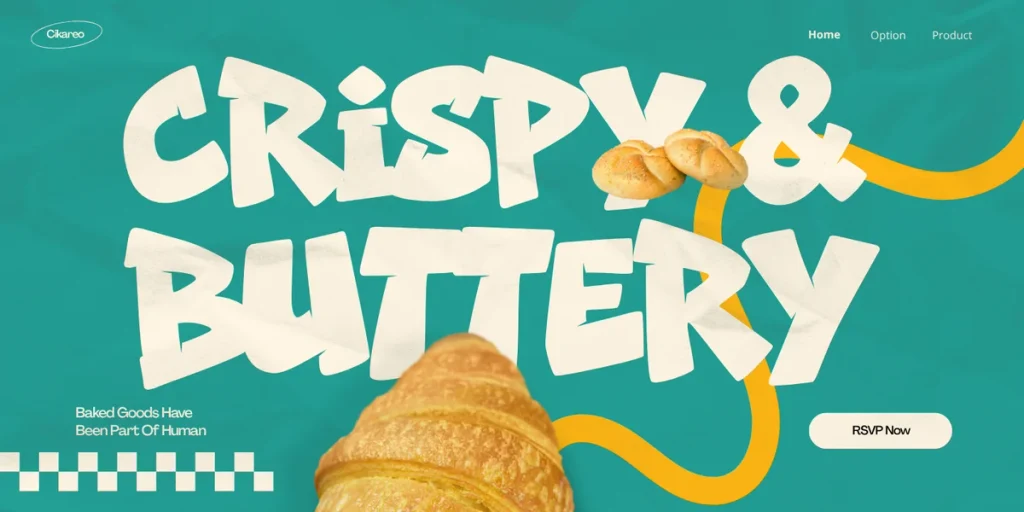
Retro design continues to provide a rich source of inspiration. Designers are revisiting the visual language of previous decades, including vintage lettering, old-school advertising, nostalgic color combinations, bold shadows, and distressed print effects.
The interesting part is how these references are combined with contemporary layouts. A retro headline can sit inside a minimalist composition, while vintage illustrations can be paired with modern photography or clean geometric shapes.
This balance makes retro design useful for brands that want to feel familiar without appearing outdated. It also works particularly well for independent fashion labels, music merchandise, café branding, and promotional posters.
For a street-inspired interpretation of retro typography, explore Metro Punch – Retro Shadow Graffiti Font. Its bold lettering and shadow treatment are suited to posters, apparel, merchandise, and branding projects that need a nostalgic urban character.
Also Read: Discover more typography inspiration from Cikareotype.
4. Experimental Typography and Distorted Letterforms
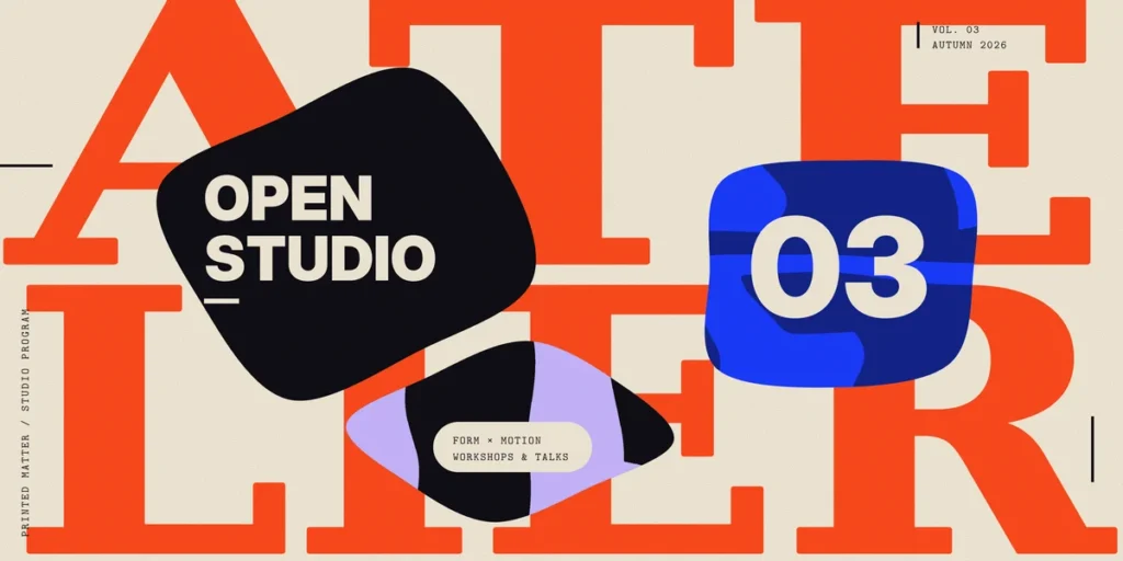
Experimental typography challenges the traditional rules of how letters should look. Characters may appear stretched, melted, layered, outlined, or exaggerated to create a more unusual visual experience.
This trend is especially useful when the typeface needs to communicate a specific mood. Distorted lettering can suggest movement, rebellion, energy, or surrealism without relying entirely on illustrations and decorative graphics.
For example, a music poster might use warped typography to express intensity, while a streetwear graphic could use layered letters to create depth. A digital campaign might combine solid and outline styles to establish a distinctive visual rhythm.
The important thing is to know when to experiment and when to simplify. Reserve highly unusual lettering for headlines, short phrases, or other focal points. Keep essential information clear so the design remains functional.
Also Read: Browse Cikareotype’s font collection for more expressive typography styles.
5. Human-Centered and Handcrafted Visuals
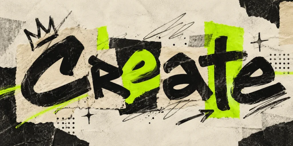
One notable direction in graphic design trends for 2026 is the growing appreciation for visuals that feel personal and handmade. Hand-drawn illustrations, imperfect lines, visible brushstrokes, candid photography, and irregular shapes can make a brand feel more approachable.
Rather than making every element perfectly symmetrical, designers can introduce controlled imperfections that communicate personality. This might involve a hand-drawn icon, a custom lettering detail, an irregular border, or a printed texture that reveals the process behind the work.
Authenticity does not mean abandoning professional standards. The strongest handcrafted designs still rely on composition, contrast, and clear communication. The difference is that they allow a little more character to show through.
For brands that want an urban, expressive identity, Hyper Sector Font offers a graffiti-inspired direction that can complement loose, street-influenced visuals.
Also Read: Learn more about Cikareotype and its street-culture roots.
6. Retro-Futurism and Digital Nostalgia
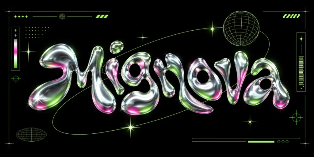
Retro-futurism combines nostalgic visual references with ideas about the future. It draws from old science-fiction graphics, early computer interfaces, futuristic lettering, metallic effects, and technological imagery.
In modern graphic design, these elements can be used to create visuals that feel both familiar and unexpected. Designers might pair retro display typography with futuristic gradients, combine pixel-inspired details with contemporary photography, or use chrome-like lettering against a simple background.
This direction works well for gaming graphics, electronic music artwork, technology branding, streetwear collections, and digital campaigns aimed at audiences who appreciate both nostalgia and experimentation.
For a stronger cyber-inspired aesthetic, explore Mignova – Retro Pshycedelic Font Its street-influenced style can complement futuristic posters, gaming visuals, and technology-inspired branding.
Also Read: Explore more design resources on Cikareotype.
7. Bold Minimalism and Strong Visual Hierarchy
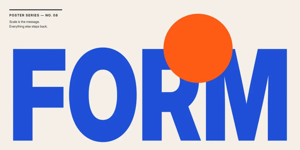
Minimalism remains useful in 2026, but it does not have to mean neutral colors, tiny typography, or empty layouts. Bold minimalism focuses on reducing unnecessary elements while making the remaining elements more impactful.
A single oversized headline, a striking color contrast, or one carefully selected illustration can communicate more effectively than a crowded composition. This approach helps audiences understand the message quickly, particularly when viewing content on mobile devices.
To create a bold minimalist design, begin with one primary message. Establish a clear hierarchy between the headline, supporting information, and visual element. Then remove anything that does not strengthen the composition.
Typography is especially important here because fewer elements mean every choice becomes more noticeable. A distinctive display font can give a simple layout the personality it needs without requiring additional decoration.
Also Read: Find more bold graffiti typography on Cikareotype.
8. Retro Color Palettes with Unexpected Accents
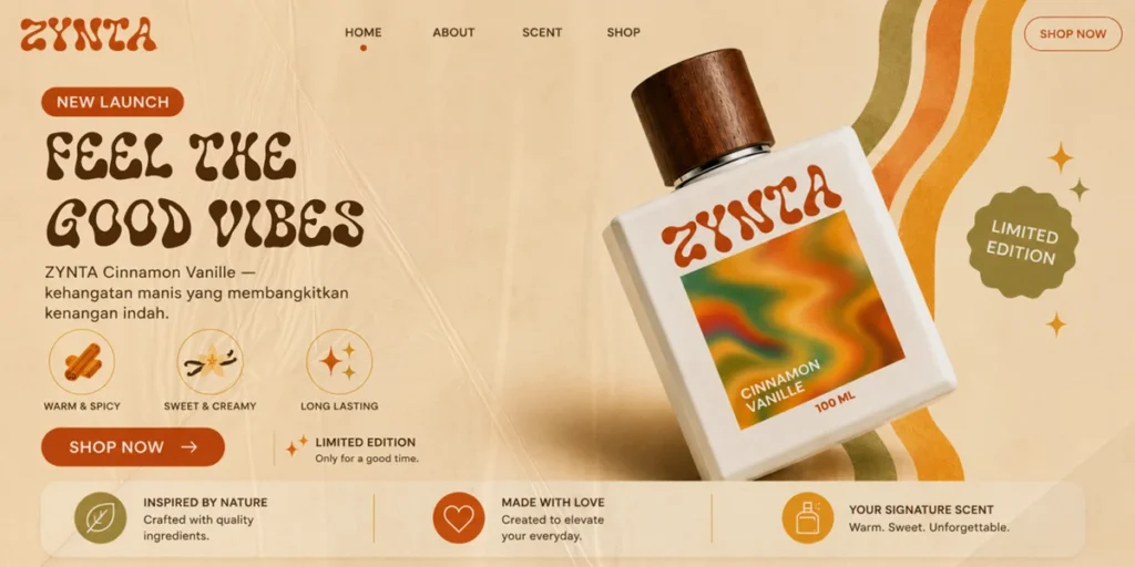
Color trends are not only about choosing the brightest palette. They are also about creating combinations that communicate a clear mood and make a design recognizable.
Retro-inspired palettes can include faded orange, warm cream, deep brown, muted green, and vintage blue. Meanwhile, contemporary graphics can introduce a single vivid accent to create contrast and direct attention toward a headline or key visual element.
The most effective approach is to establish a small, consistent palette before adding decorative effects. Use dominant colors to define the overall atmosphere, supporting colors to organize information, and accent colors to highlight the most important details.
For example, a streetwear poster might combine charcoal, cream, and burnt orange, with one electric-green accent. A retro-inspired brand identity could use muted tones with a bold shadowed headline.
Pair these palettes with expressive lettering to create a more cohesive visual identity. Mignova – Retro Pshycedelic Font is one option for adding a nostalgic, dimensional typography treatment to such compositions.
Also Read: Get more inspiration from the Cikareotype Blog.
9. Editorial Layouts, Collage, and Controlled Chaos
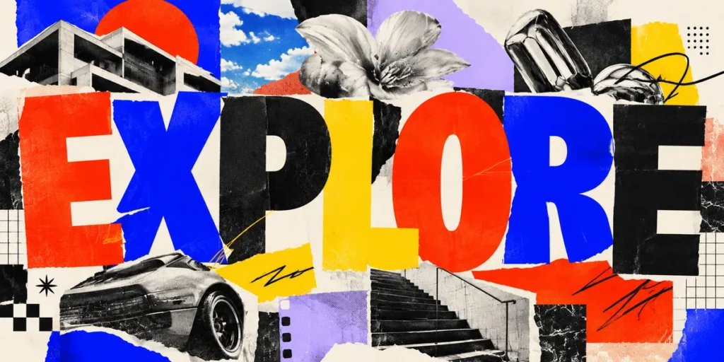
Editorial design is becoming a useful source of inspiration for posters, social media graphics, and branding. Instead of relying on rigid grids for every element, designers can experiment with asymmetrical compositions, overlapping images, varied text sizes, and layered visual details.
Collage is particularly effective because it combines different materials and references into one composition. Photography, hand-drawn marks, paper textures, stamps, and typography can work together to tell a story.
However, a successful collage still needs structure. Establish one dominant focal point, use contrast to separate important information, and create enough breathing room for the viewer to understand the message.
This approach is ideal for independent fashion campaigns, album artwork, creative portfolios, zines, and event posters. Graffiti fonts can provide a strong typographic anchor within a collage, especially when the surrounding elements are varied in scale and texture.
Also Read: Explore Cikareotype’s font collection for display fonts that can anchor your next poster or collage.
10. Streetwear Graphics and Typography-Led Branding
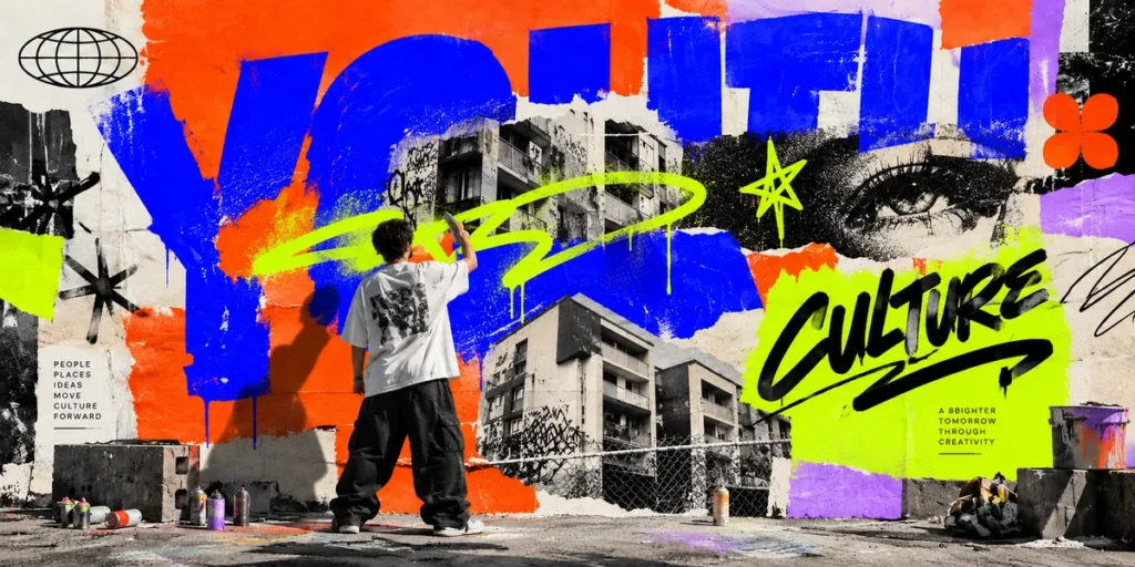
Streetwear graphic design continues to offer a strong creative direction for brands that want to communicate identity through lettering, symbols, and bold visual statements.
Rather than relying on a logo alone, a streetwear identity can combine expressive typography, distinctive graphic marks, limited color palettes, and repeatable visual elements. These components can then be applied consistently across T-shirts, hoodies, packaging, posters, product photography, and social media.
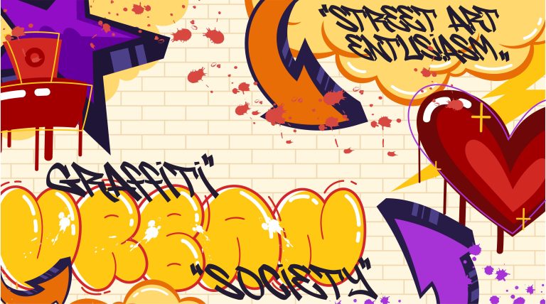
Typography is especially important because it can establish the attitude of a collection. Chunky graffiti lettering can feel energetic and rebellious, while a layered display font can introduce depth and a more dimensional appearance.
For designers building a streetwear collection Metro Punch, and Roguepunk offer different directions for edgy, retro, and cyber-inspired graphics.
Choose the style that fits the brand rather than combining every trend in one design. A consistent typographic identity is more recognizable than a collection of unrelated visual effects.
Also Read: Best Graffiti Fonts for Social Media: How to Boost Your Brand Aesthetics.
How to Apply These Graphic Design Trends in Your Next Project
Following graphic design trends does not mean using every popular style at once. The best approach is to identify the direction that supports your message, audience, and brand personality.
Start by choosing one main trend. If your project needs energy, experiment with expressive typography. If it needs warmth and authenticity, explore handmade textures. If you want a nostalgic identity, combine retro references with a contemporary layout.
Next, select a typeface that reinforces the concept. Consider the weight, proportions, character shapes, and overall mood of the lettering. Use a supporting typeface when necessary to keep longer text readable.
Finally, test the design in its actual context. A poster must communicate from a distance, a T-shirt graphic needs a strong silhouette, and a social media post must remain recognizable on a small screen.
For additional visual references, explore the Adobe Express 2026 Design Trends overview. Its discussion of tactile experiences, expressive lettering, organic imperfections, and storytelling layouts provides useful context for experimenting with the styles covered in this article.
Also Read: Discover more design and typography articles on Cikareotype.
From Our Desk: Make Trends Work for Your Own Style
At Cikareotype, we see typography as a creative tool for building visual identity, not simply a way to display words. Street culture, music, everyday lettering, and expressive forms can all inspire designs that feel distinctive and memorable.
The most useful trend is not necessarily the most popular one. It is the one that helps you communicate an idea more effectively. A handmade texture may be perfect for one brand, while bold graffiti lettering may be the right choice for another.
Experiment with different typefaces, create variations, and refine your composition until every element serves a purpose. Use trends as creative starting points, then develop a visual language that audiences can recognize as your own.
Explore the Cikareotype font collection to discover more graffiti-inspired typefaces for branding, posters, apparel, and digital projects.
Conclusion
The graphic design trends of 2026 point toward a more expressive and character-driven approach to visual communication. From oversized typography and tactile textures to retro-futurism, bold minimalism, and streetwear graphics, these directions give designers new ways to create work that stands out.
However, trends are most effective when they support a clear idea. Choose the styles that suit your audience, build a consistent visual hierarchy, and use typography as an intentional part of your design strategy.
Ready to explore new creative possibilities? Discover Wolf Fangs, Metro Punch, Gruze, and more expressive typefaces in the Cikareotype font collection.
Make your next design bold, intentional, and unmistakably yours.
Also Read: Visit the Cikareotype Blog for more typography and design inspiration.