A great T-shirt design does more than decorate a piece of clothing. It communicates a brand’s personality, attracts attention, and gives people a reason to wear and remember it. For clothing brands, independent designers, and print-on-demand sellers, the right graphic can help transform a basic T-shirt into a recognizable product.
From oversized typography and graffiti lettering to vintage-inspired artwork and distressed graphics, there are countless ways to create T-shirts with a distinctive visual identity. The key is choosing a style that connects with your target audience while remaining consistent with your brand.
Typography is especially important in graphic apparel. A bold display font can become the main visual element, while a carefully selected graffiti typeface can give a design an expressive, street-inspired character. Color, composition, print placement, and texture help bring everything together.
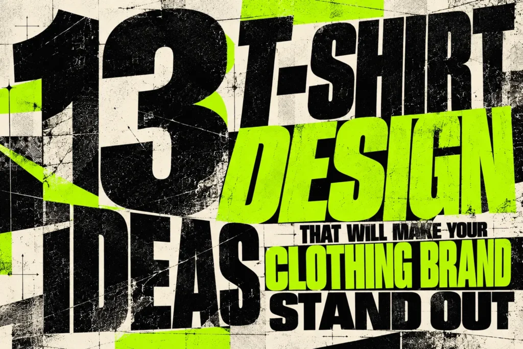
In this guide, we’ll explore 13 T-shirt design ideas you can use to develop your next clothing collection, merchandise project, or print-on-demand product.
1. Oversized Typography T-Shirt Designs
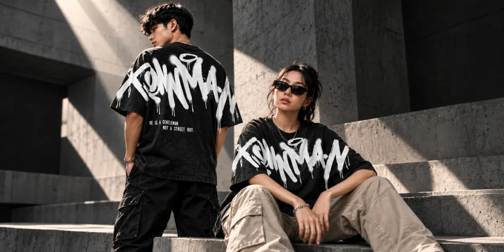
Oversized typography is an effective way to make a T-shirt visually striking without relying on complicated illustrations. Large words, condensed letterforms, and unconventional text placement can turn a simple phrase into the main feature of the garment.
Try placing a large word across the chest or using an oversized back print with a smaller logo on the front. You can experiment with stacked lettering, stretched proportions, tight spacing, or cropped words that extend beyond the design area.
For streetwear brands, choose bold display fonts with strong silhouettes and enough character to stand out from a distance. Keep supporting elements minimal so the typography remains the focal point.
Design tip: Start with one short word or phrase. Experiment with scale, spacing, and placement before adding extra graphics.
Recommended font: Dyzero Vandals – Graffiti Tagging Font for energetic lettering that gives oversized apparel graphics a strong visual presence.
2. Graffiti Typography and Urban Streetwear Graphics
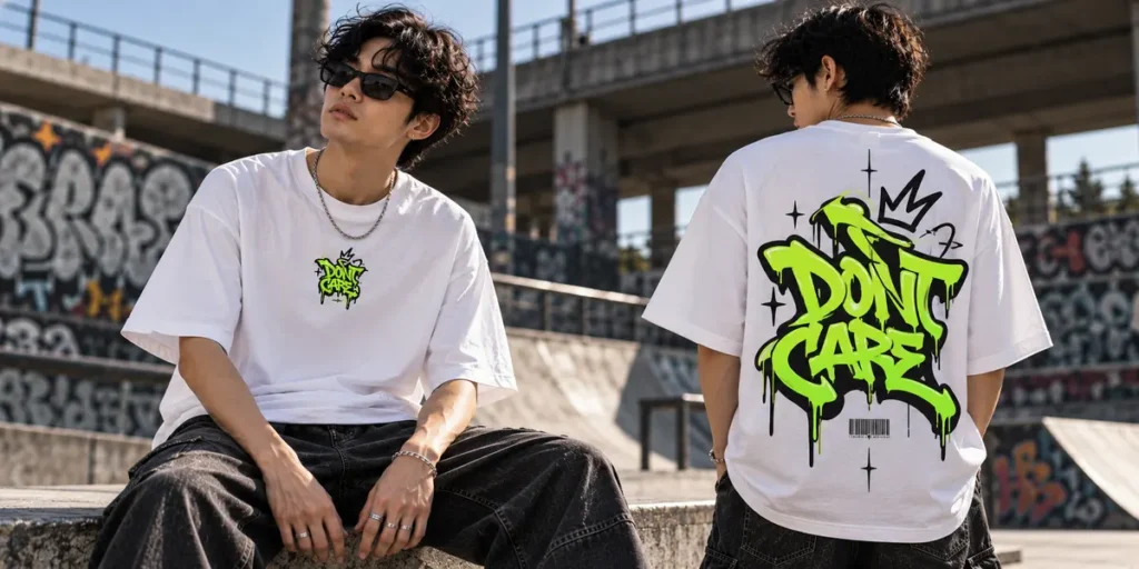
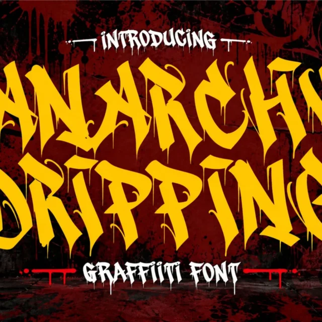
Graffiti typography is a natural choice for clothing brands inspired by skateboarding, hip-hop, underground music, and urban culture. Its expressive shapes, irregular strokes, and energetic lettering can give a T-shirt a rebellious personality.
You can use graffiti lettering as a standalone chest graphic, combine it with hand-drawn symbols, or create a large back print supported by smaller details on the sleeves. Bubble letters, wildstyle-inspired forms, sharp tags, and dripping characters each create a different mood.
The most effective designs balance expressive lettering with readability. A highly decorative font can work well for a short brand name, while a simpler typeface can handle supporting information.
Design tip: Choose one dominant lettering style instead of mixing too many graffiti effects in a single composition.
Recommended font: Great Squater – Wild Graffiti Shadow Font for bold wildstyle lettering and layered shadows that suit urban apparel graphics.
Also Read: Best Graffiti Fonts for Social Media: How to Boost Your Brand Aesthetics
3. Retro and Vintage-Inspired T-Shirt Graphics
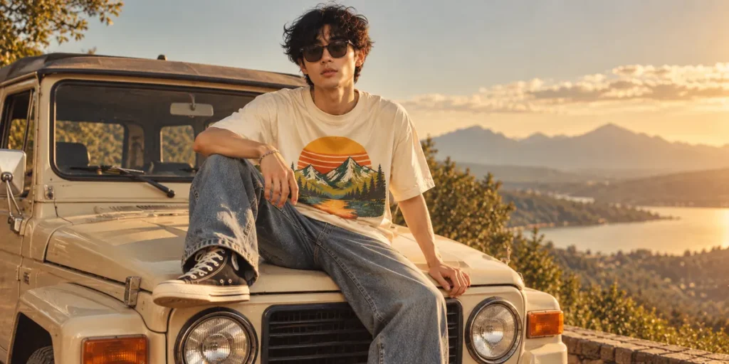
Retro T-shirt graphics bring a sense of nostalgia to modern apparel. Inspired by vintage advertising, classic sportswear, old concert merchandise, and 1970s or 1990s visual culture, this style works well for brands that want their designs to feel familiar yet distinctive.
Use chunky display lettering, arched text, vintage badges, simple illustrations, and limited color palettes. Combinations such as faded orange, mustard yellow, cream, burgundy, and dark green can reinforce a nostalgic atmosphere.
You don’t need to make every element look old. A clean layout with retro typography and a subtle shadow can feel more contemporary than a heavily distressed design.
Design tip: Build a consistent visual system for a collection, such as vintage motorsport, retro outdoor adventures, or old-school music merchandise.
4. Distressed Lettering and Worn-In Prints
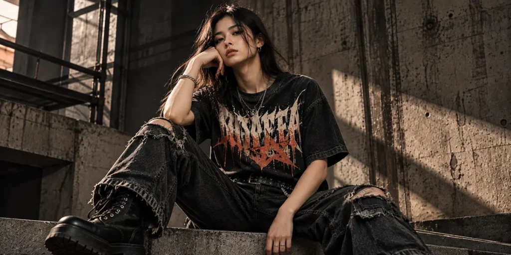
Distressed lettering gives T-shirt graphics a weathered, imperfect appearance. Inspired by vintage band shirts, old screen prints, punk merchandise, and workwear graphics, this style can make a new design feel as though it has a story behind it.
Start with a bold font, then introduce controlled imperfections such as faded ink, rough edges, scratches, broken outlines, or subtle halftone patterns. The texture should support the lettering rather than make it difficult to read.
Distressed effects work particularly well on dark garments, washed black cotton, faded gray, and earthy neutral colors. They can also add character to simple one-color designs.
Design tip: Test the texture at the final print size. Tiny scratches and fine details may disappear when printed on fabric.
Recommended font: Antiink – Brushes Graffiti Font for expressive monoline lettering with dripping details that can complement worn-in streetwear graphics.
5. Minimalist Typography and Small Chest Prints
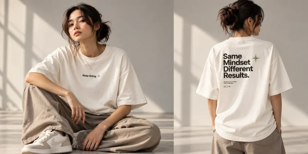
Not every memorable T-shirt needs a large graphic. Minimalist typography focuses on simplicity, thoughtful spacing, and a clear message. It is suitable for brands that prefer understated streetwear, everyday essentials, or contemporary casual apparel.
Consider a small wordmark on the left chest, a short phrase centered near the neckline, or a subtle typographic detail near the hem. A simple front print can also be paired with a larger graphic on the back.
Choose a clean sans-serif, a refined serif, or a monoline typeface depending on the personality of your brand. The quality of the letterforms and spacing matters more when the design contains very few elements.
Design tip: Use negative space intentionally. Avoid adding extra symbols just to fill an otherwise empty composition.
6. Y2K and Futuristic Graphic T-Shirts
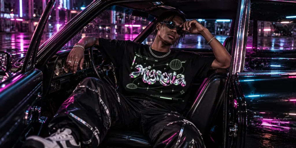
Y2K-inspired graphics draw from early-2000s digital culture, metallic finishes, futuristic lettering, and playful technology references. This direction is useful for brands targeting audiences who enjoy experimental fashion, digital nostalgia, and bold visual statements.
Try chrome-inspired typography, pixel symbols, digital grids, abstract interfaces, or metallic-looking shapes. Pair these elements with electric blue, silver, purple, hot pink, or acid green for a vibrant visual identity.
For a more wearable result, combine one futuristic graphic with a simple garment color and a clear layout. A small front symbol and a large back design can create a cohesive look without overwhelming the shirt.
Design tip: Use digital effects selectively. Too many gradients, glows, and metallic elements can compete with the main message.
7. Bold Bubble Lettering
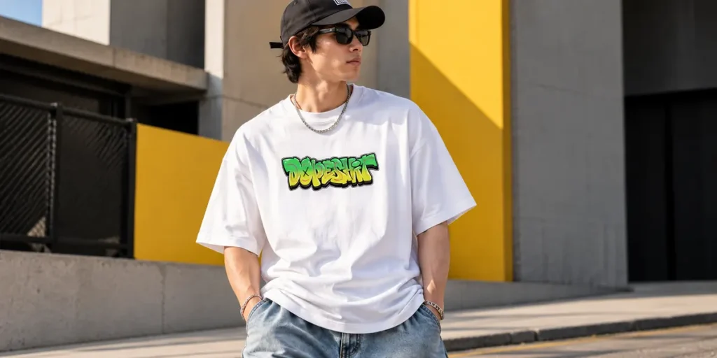
Bubble lettering creates rounded, playful shapes that feel energetic and approachable. It can work for youth-oriented streetwear, creative merchandise, skate-inspired clothing, and brands that want a more playful identity.
Use inflated letterforms, overlapping shapes, thick outlines, or contrasting shadows to give the design a distinctive silhouette. You can keep the palette simple with two contrasting colors or use brighter combinations such as pink and orange, blue and yellow, or green and purple.
Bubble lettering is particularly effective for short brand names and compact phrases. For longer messages, make sure the letters remain readable when viewed from a distance.
Design tip: Let the lettering carry the design. Add only a few supporting illustrations or symbols to reinforce the concept.
Recommended font: Melto Gofer – Bubble Graffiti Font for rounded, playful lettering with an optional dripping style that adds personality to graphic apparel.
8. Oversized Back Prints with Minimal Front Branding
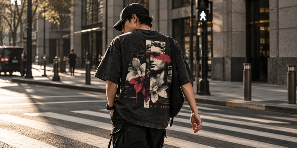
A large back print creates a strong visual statement while allowing the front of the T-shirt to remain understated. This layout is popular for graphic streetwear, independent clothing labels, and limited-edition merchandise.
Place a small logo or wordmark on the left chest, then develop a larger composition for the back. It could feature bold typography, a central illustration, a collection title, or a combination of lettering and supporting graphics.
The front and back should feel connected. Reuse the same font, color palette, symbol, or visual theme so the garment looks like a complete product rather than two unrelated designs.
Design tip: Plan the back graphic around the shape of the garment. Check its size and position on the actual T-shirt mockup before preparing the print file.
9. Typography and Illustration Combinations
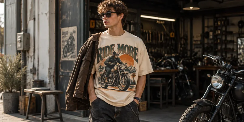
Combining typography with illustration can make a T-shirt design more expressive and help communicate a recognizable theme. The illustration provides visual storytelling, while the lettering establishes the message and brand identity.
For example, a graphic inspired by motorcycles could combine a custom wordmark with a line drawing of a bike. A music-themed design might pair oversized lettering with abstract sound waves, while an outdoor collection could use a mountain illustration and vintage display type.
Keep the relationship between the two elements clear. The illustration can sit behind the typography, frame the text, or serve as a supporting graphic underneath it.
Design tip: Match the illustration style to the typeface. Rough hand-drawn art pairs naturally with expressive lettering, while geometric illustrations work well with structured typography.
Also Read: 5 Best-Selling Monoline Graffiti Fonts for Your Creative Projects
10. Athletic and Collegiate Typography
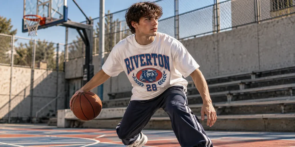
Athletic and collegiate graphics take inspiration from varsity uniforms, classic sports merchandise, racing apparel, and university lettering. These designs often feature arched words, bold block letters, oversized numbers, outlined text, and badge-like compositions.
You can adapt the style for a clothing brand without using an actual sports team’s identity. Create a fictional club, neighborhood-inspired collection, creative crew, or brand-specific slogan.
Use combinations such as navy and cream, forest green and white, burgundy and gold, or royal blue and red. Add small stars, stripes, or numbers only when they support the overall concept.
Design tip: Establish a clear hierarchy: a large team-style name, a smaller supporting line, and one optional number or emblem.
11. Dripping and Melted Typography
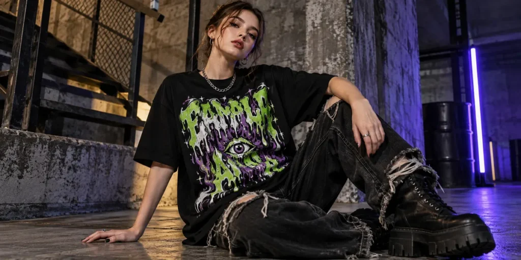
Dripping typography uses liquid-like letterforms, melting shapes, and extended drips to create an unusual, eye-catching graphic. It works especially well for alternative streetwear, skate graphics, music merchandise, and designs with a rebellious or surreal mood.
You can make the effect the main feature of the lettering or combine it with a more conventional display font. Try contrasting the organic shapes with geometric symbols, rough textures, or a clean background to keep the composition balanced.
Color choices can change the mood significantly. Black and white can create a stark, high-contrast design, while acid green, purple, red, or orange can produce a more playful or aggressive visual identity.
Design tip: Check that the drips remain distinct at the final print size. Excessively thin details may become unclear on fabric.
Recommended font: Gorvex – Raw Graffiti Drip Font for rough, expressive dripping lettering with an underground streetwear character.
12. Monochrome and High-Contrast Graphics
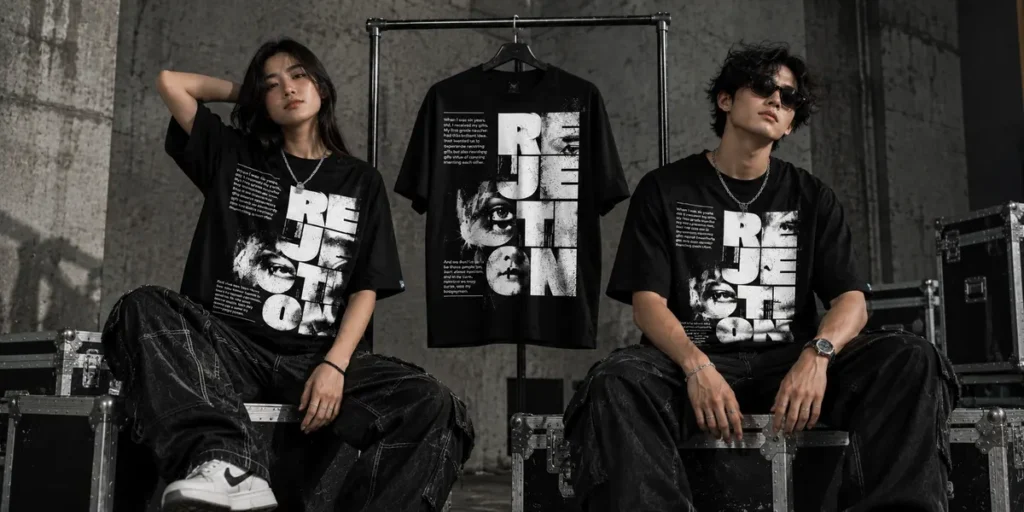
Monochrome T-shirt graphics use a limited palette, often black and white or a single ink color, to create a clear and impactful design. This approach is practical for brands that want a consistent visual identity across multiple garments.
Instead of relying on many colors, focus on silhouette, contrast, texture, and composition. Large white lettering on a black shirt can feel bold and direct, while black artwork on an off-white garment can create a vintage editorial look.
You can also use halftone shading, outlined typography, simple line art, or reversed lettering to add depth while maintaining a limited palette.
Design tip: Preview the artwork against the actual garment color. A design that looks clear on a white canvas may lose contrast when printed on a colored shirt.
13. Experimental Typography and Mixed-Lettering Styles
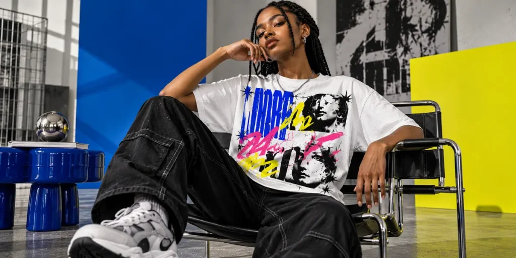
Experimental typography gives clothing brands room to develop a more original visual identity. Instead of using lettering in a conventional way, you can combine different type styles, distort individual characters, vary letter spacing, or build an asymmetrical composition.
For example, pair a bold condensed headline with a handwritten accent, place a small monospaced line beneath oversized lettering, or use contrasting type styles to separate the brand name from the supporting message.
The aim is not to use as many fonts as possible. Each typeface should have a clear role in the composition. Two complementary styles are often enough to create contrast without making the design feel disorganized.
Design tip: Start with one dominant font and introduce a secondary typeface only when it improves hierarchy or adds meaningful personality.
How to Choose the Right T-Shirt Design for Your Clothing Brand
With so many design directions available, the best choice depends on your audience, brand identity, product type, and production method. Before developing a full collection, consider the following factors.
Understand Your Target Audience
Think about the people who will wear your products. A streetwear audience may respond to expressive graffiti lettering and oversized back prints, while a minimalist fashion audience may prefer subtle typography and restrained graphics.
Look beyond broad demographic categories. Consider the music, visual culture, hobbies, and fashion references that influence your customers.
Build a Consistent Visual Identity
A clothing collection should feel connected even when individual designs use different concepts. You can create consistency through a shared typeface, recurring symbol, limited color palette, or recognizable print placement.
This doesn’t mean every T-shirt must look identical. A consistent design system gives you room to experiment while helping customers recognize your brand.
Choose Fonts That Match the Concept
Typography affects the personality of a T-shirt as much as its wording. A retro shadow font creates a different impression from a clean sans-serif or a dripping graffiti typeface.
Use display fonts for short headlines, brand names, and graphic statements. For smaller supporting text, prioritize legibility and avoid overly decorative lettering.
Consider the Printing Method
Your design should work with the printing method you intend to use. Screen printing often suits bold shapes and limited-color graphics, while direct-to-garment (DTG) and direct-to-film (DTF) printing can accommodate more detailed artwork, depending on the printer and production specifications.
Check minimum line thickness, transparency, color handling, and final print dimensions before production. Always review a sample when possible.
Also Read: Unleash Your Creativity: A Step-by-Step Guide to Installing Custom Fonts in Procreate
From Our Desk: Make Your T-Shirt Designs More Memorable
At Cikareotype, we believe typography can do more than display a message. Distinctive letterforms can become a recognizable part of a clothing brand’s identity.
When developing a T-shirt graphic, start with the concept before choosing the font. Decide whether the design should feel rebellious, nostalgic, playful, futuristic, or understated. Then select lettering, colors, and textures that support that direction.
For streetwear graphics, graffiti and display fonts can create an immediate focal point. Retro shadow lettering can give a collection a nostalgic character, while bubble and dripping styles can bring more visual energy to a limited-edition release.
You can explore the Cikareotype font collection to discover lettering styles for apparel, merchandise, branding, and other creative projects.
Conclusion
The best T-shirt designs combine a clear concept with strong visual execution. Oversized typography, graffiti graphics, vintage lettering, distressed prints, and experimental compositions all offer different ways to help a clothing brand stand out.
You don’t need to follow every trend or fill every shirt with graphics. Start with a style that fits your audience, build a recognizable visual identity, and make deliberate choices about typography, color, placement, and printing.
Most importantly, experiment with different concepts before committing to a full collection. A distinctive font or well-composed graphic can turn a simple T-shirt into a product that people recognize and remember.
Ready to create your next apparel collection? Explore Cikareotype’s display and graffiti fonts to find expressive lettering for your next T-shirt design.