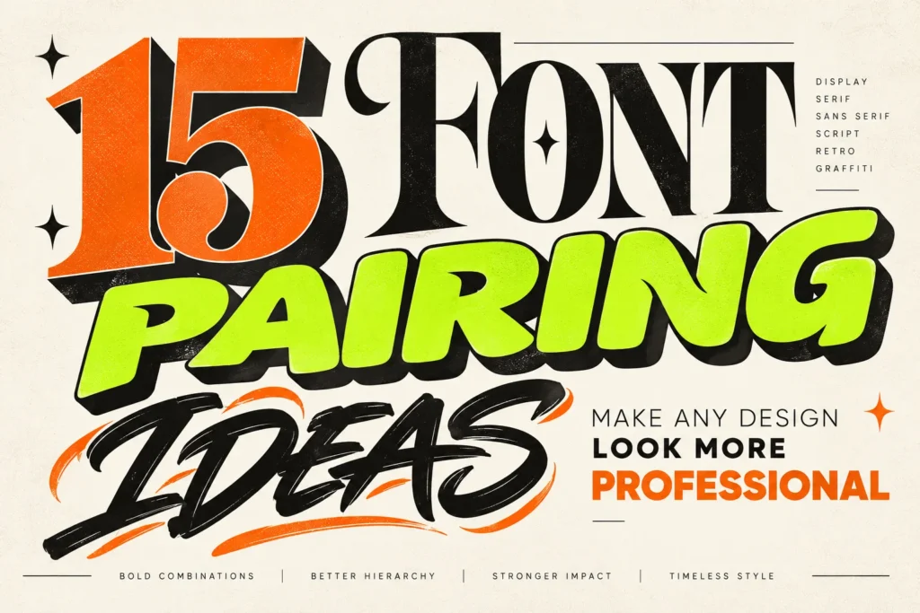
Choosing the right fonts can make a good design look professional, memorable, and easy to understand. However, combining two or more typefaces can be challenging, especially when you’re a beginner, a branding designer, or a content creator working on multiple projects.
One font might have a bold personality, while another needs to remain readable. A decorative display typeface may look impressive in a headline but become difficult to read in a paragraph. Meanwhile, a clean sans serif might feel too ordinary when used alone in a poster or brand identity.
This is where font pairing ideas become useful. By combining typefaces with different but complementary characteristics, you can create stronger visual hierarchy, establish a recognizable brand personality, and guide the audience through your design.
In this guide, we’ll explore 15 practical font combinations using display, sans serif, serif, and script styles. You’ll also discover how to apply them to posters, logos, packaging, social media graphics, and other creative projects.
What Makes a Good Font Pairing?
A successful font pairing starts with contrast and compatibility. The fonts should have distinct roles, but they should still feel like they belong in the same design.
For example, a bold display font can attract attention in a headline, while a neutral sans serif keeps supporting information readable. An elegant serif can add sophistication to a brand name, while a script font introduces a personal or handcrafted touch.
Before choosing a combination, consider three principles.
1. Create a Clear Visual Hierarchy
Decide which information the audience should notice first. Usually, the headline or brand name receives the most attention, while subtitles, descriptions, and supporting information use a quieter typeface.
2. Combine Contrast with Compatibility
Pair fonts that differ in a meaningful way. A geometric sans serif can balance an expressive display font, while a refined serif can soften an otherwise bold composition.
3. Limit the Number of Typefaces
Two fonts are often enough for a professional design. A third can be useful for a specific purpose, such as a short handwritten accent or a small technical label. However, adding more fonts without a clear reason can make the composition feel inconsistent.
For a deeper introduction to font categories and their uses, explore Adobe’s guide to font types.
15 Font Pairing Ideas for Professional Designs
The following combinations are starting points rather than strict rules. Test the fonts in your actual layout, adjust their size and spacing, and choose the pairing that best supports your project’s personality.
1. Bold Display Font + Clean Sans Serif
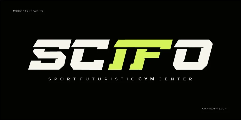
Best for: Posters, advertisements, headlines, and social media graphics.
A bold display font paired with a clean sans serif is one of the most versatile typography combinations. The display typeface attracts attention, while the sans serif makes additional information easy to read.
For example, use Torq – Futuristic Display Font for a prominent headline and pair it with Inter for descriptions, dates, or supporting copy. Torq’s technical character creates a distinctive focal point, while Inter provides a more neutral visual counterbalance.
This combination works particularly well for technology campaigns, gaming graphics, automotive promotions, and modern event posters.
Design tip: Keep the display font to short headlines. Use the supporting sans serif for longer text, and create hierarchy through size and weight rather than adding unnecessary decorative effects.
2. Elegant Serif + Modern Sans Serif
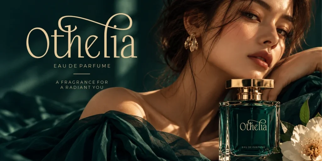
Best for: Branding, editorial layouts, beauty products, and premium packaging.
Serif and sans serif fonts create a classic balance between sophistication and clarity. The serif brings personality and a sense of refinement, while the sans serif keeps the layout contemporary.
A useful combination is Elesthin Bloom – Elegant Display Serif Font with Montserrat. Elesthin Bloom offers a refined, vintage-inspired serif character, while Montserrat provides a clean geometric structure for supporting information.
Use Paradisea for a product name, logo-style headline, or packaging title. Reserve Montserrat for product descriptions, ingredient information, navigation, or small labels.
Design tip: Give the serif enough space to express its character. Avoid using both fonts at their heaviest weights, which can make the design feel visually crowded.
3. Retro Display Font + Geometric Sans Serif
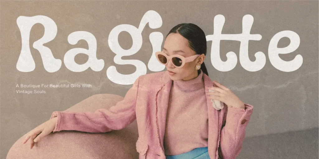
Best for: Vintage posters, music promotions, apparel branding, and merchandise.
Retro lettering can give a design an immediate sense of nostalgia. However, a composition made entirely from decorative vintage type can become difficult to navigate.
Combine Paradisea – Elegant Vintage Font with a geometric sans serif such as Poppins. Paradisea introduces bold, retro-inspired shadow lettering, while Poppins provides a simpler structure for supporting text.
This pairing works well for event posters, streetwear collections, music artwork, and promotional graphics that need both personality and clarity.
Design tip: Let the retro display font dominate the headline. Use the geometric sans serif for dates, locations, descriptions, and calls to action.
4. Graffiti Display Font + Neutral Sans Serif
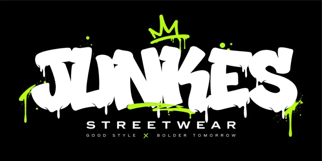
Best for: Streetwear branding, music artwork, urban posters, and youth-oriented campaigns.
Graffiti fonts are expressive by nature. Their irregular shapes, layered outlines, and distinctive letterforms can give a design a strong identity, but supporting text should usually remain more restrained.
Try Gloze – Melted & Dripping Style Font with a neutral sans serif such as Inter. Gloze can create a striking headline or graphic wordmark, while Inter keeps secondary information readable.
The combination is particularly useful when a design needs to feel energetic without becoming chaotic.
Design tip: Avoid pairing two highly decorative fonts at equal visual strength. Let Gruze establish the mood, then use the sans serif to organize the rest of the layout.
5. Script Font + Simple Sans Serif
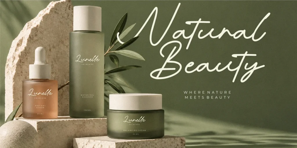
Best for: Personal branding, lifestyle products, invitations, and social media quotes.
Script fonts introduce movement and a handwritten quality. They can make a brand feel personal, friendly, elegant, or artistic, depending on the letterforms.
For a refined handwritten accent, try Romantic Diary – Minimalist Monoline Script Font with a simple sans serif such as Open Sans. Romantic Diary has a brush-inspired, graffiti-influenced character, so this combination is more suitable for expressive creative brands than traditional luxury identities.
Use the script font for a short phrase, signature-like accent, or selected word. Keep the supporting text in Open Sans for better readability.
Design tip: Script fonts are most effective when used selectively. Avoid setting long paragraphs in decorative handwriting styles.
6. Condensed Display Font + Humanist Sans Serif
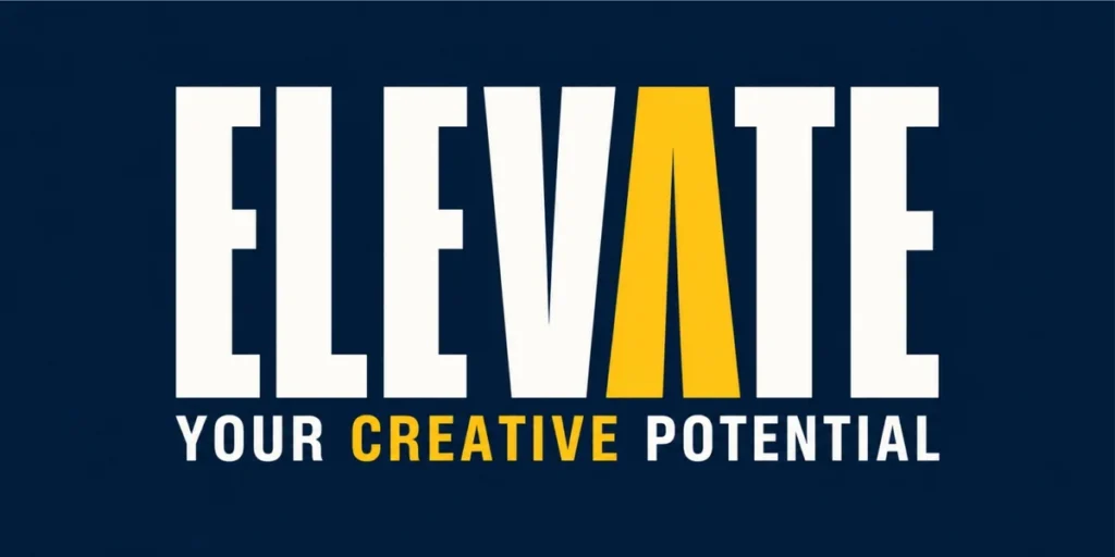
Best for: Editorial posters, sports campaigns, announcements, and event graphics.
Condensed display fonts allow you to fit large headlines into limited space. Their narrow proportions also create a strong vertical rhythm that works well in editorial layouts.
Pair a bold condensed display typeface with a humanist sans serif such as Source Sans 3. The display font can carry the main headline, while Source Sans 3 handles the supporting information in a more open and readable style.
This combination is useful for event posters, campaign announcements, magazine covers, and social graphics with several pieces of information.
Design tip: Use the condensed font such The Horison for short, prominent phrases. Avoid shrinking long paragraphs into a narrow typeface simply to make them fit.
7. Vintage Serif + Handwritten Script
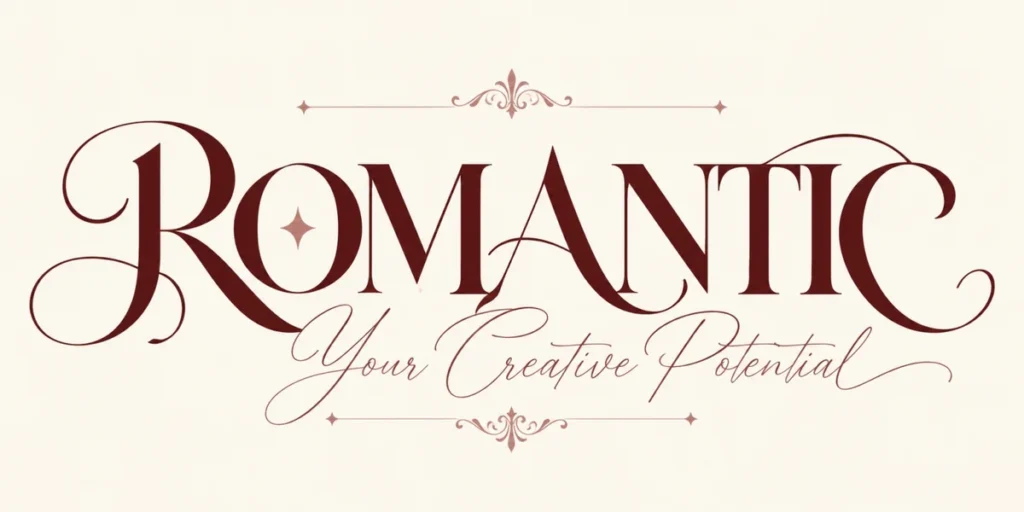
Best for: Boutique branding, coffee packaging, handmade products, and lifestyle identities.
A vintage serif paired with handwritten script can create a warm and nostalgic personality. The serif provides structure, while the script introduces a more personal accent.
For example, use Paradisea for a product name or main brand statement, then add a restrained handwritten script for a short secondary phrase. The script can feel like a signature, personal note, or small decorative detail.
This pairing works well for artisan products, cafés, specialty food packaging, vintage-inspired merchandise, and boutique branding.
Design tip: Make sure the script has enough contrast against the serif. If both fonts have too many decorative details, the design can become difficult to read.
8. Futuristic Display Font + Technical Sans Serif
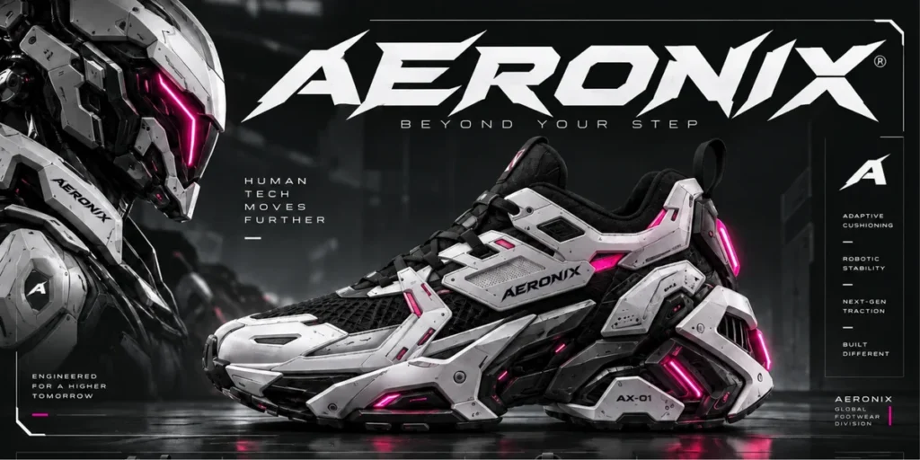
Best for: Technology branding, gaming graphics, automotive design, and digital campaigns.
Futuristic display fonts often use sharp angles, geometric construction, and technical-looking letterforms. They can establish a forward-looking identity, especially when combined with a clean sans serif.
Use Nexroid Font as the headline font and pair it with a technical sans serif such as IBM Plex Sans. Torq creates the futuristic visual statement, while IBM Plex Sans supports detailed information, product specifications, and smaller labels.
The combination is effective for gaming posters, technology product launches, motorsport graphics, and digital interfaces that need an expressive headline.
Design tip: Use color and spacing to reinforce the technical aesthetic. Avoid adding too many visual effects when the letterforms already provide enough character.
9. Bold Sans Serif + Editorial Serif
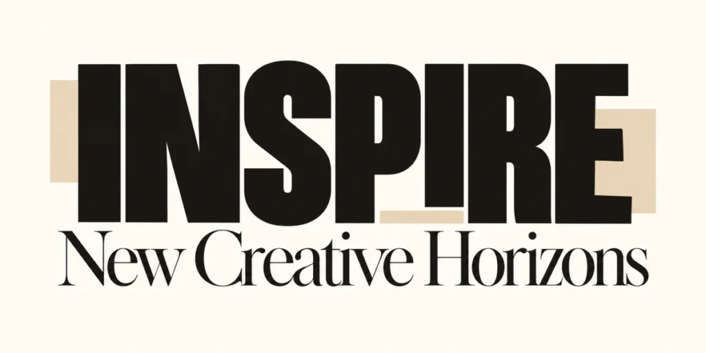
Best for: Branding presentations, magazine layouts, websites, and professional social media content.
Sometimes the best pairing uses a sans serif as the headline and a serif as the supporting typeface. This reverses the familiar serif-headline approach and can create a modern editorial appearance.
Try a bold sans serif such as Montserrat for headings and a readable serif such as Maffio Kartela for longer supporting text. The contrast between the geometric headline and the more traditional serif gives the composition a clear hierarchy.
This combination works particularly well for creative portfolios, agency websites, editorial graphics, and branding presentations.
Design tip: Keep the roles consistent throughout the project. If the sans serif handles headings, use the serif for paragraphs, quotations, or selected editorial details.
10. Bubble Display Font + Rounded Sans Serif
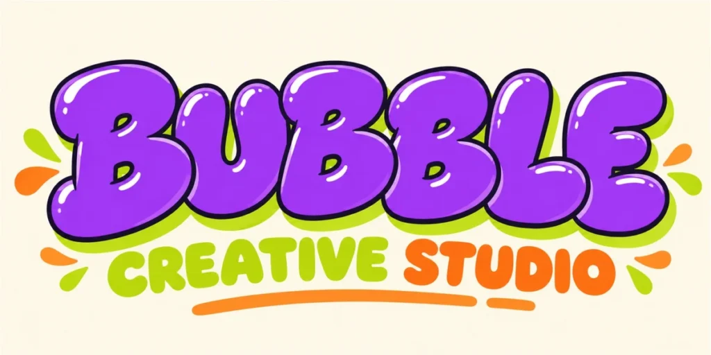
Best for: Youth brands, playful packaging, casual merchandise, and colorful social media graphics.
Rounded display fonts can make a design feel friendly, approachable, and energetic. However, combining them with another highly decorative typeface may reduce clarity such as Bubble Block Font.
Pair a playful bubble-style display font with a rounded sans serif such as Nunito. The display font creates the visual hook, while Nunito provides a softer and more readable supporting style.
Use this combination for snack packaging, playful product branding, creative workshops, children’s merchandise, or social posts aimed at a younger audience.
Design tip: Use contrasting sizes and weights rather than relying on many colors or effects. A large rounded headline and a smaller, simple subtitle can be enough.
11. Monoline Handwritten Font + Geometric Sans Serif
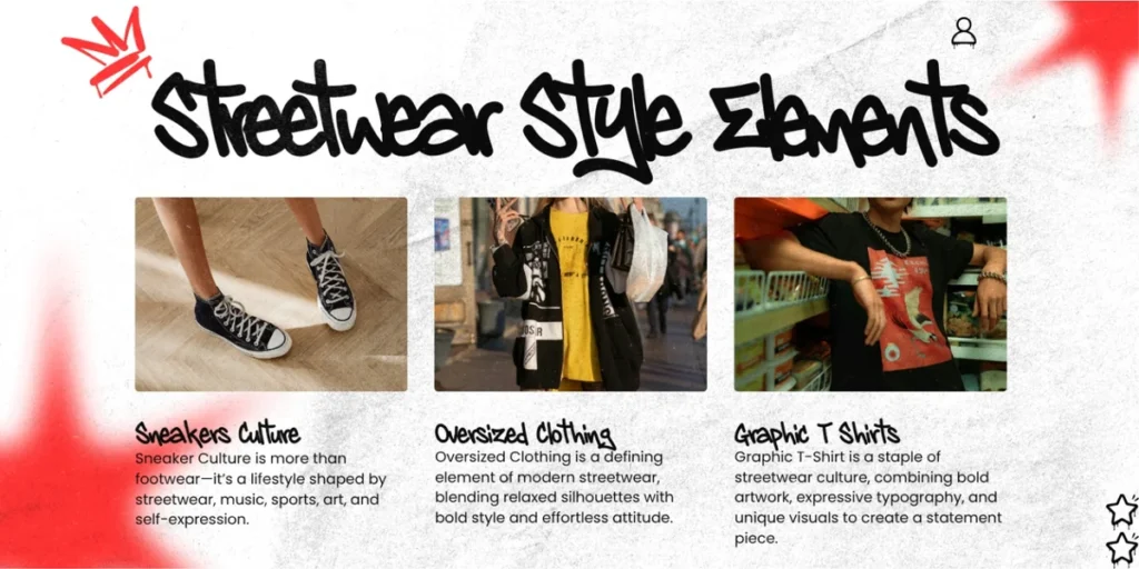
Best for: Lifestyle branding, labels, creator identities, and casual product packaging.
Monoline handwritten fonts use strokes with relatively consistent thickness, creating a natural, drawn quality. They can feel expressive without being as visually heavy as bold graffiti lettering.
Pair a handwritten style such as Dyzero Vandals – Monoline Handwritten Graffiti Font with a geometric sans serif such as Poppins.
Straight Wave can provide a distinctive handwritten headline or signature-style accent, while Poppins organizes the supporting information. This pairing works well for creator merchandise, casual lifestyle branding, labels, and promotional graphics.
Design tip: Keep the handwritten element large enough to remain clear. Test it at the final size, especially when using it on small labels or mobile graphics.
12. Blackletter Display Font + Clean Sans Serif
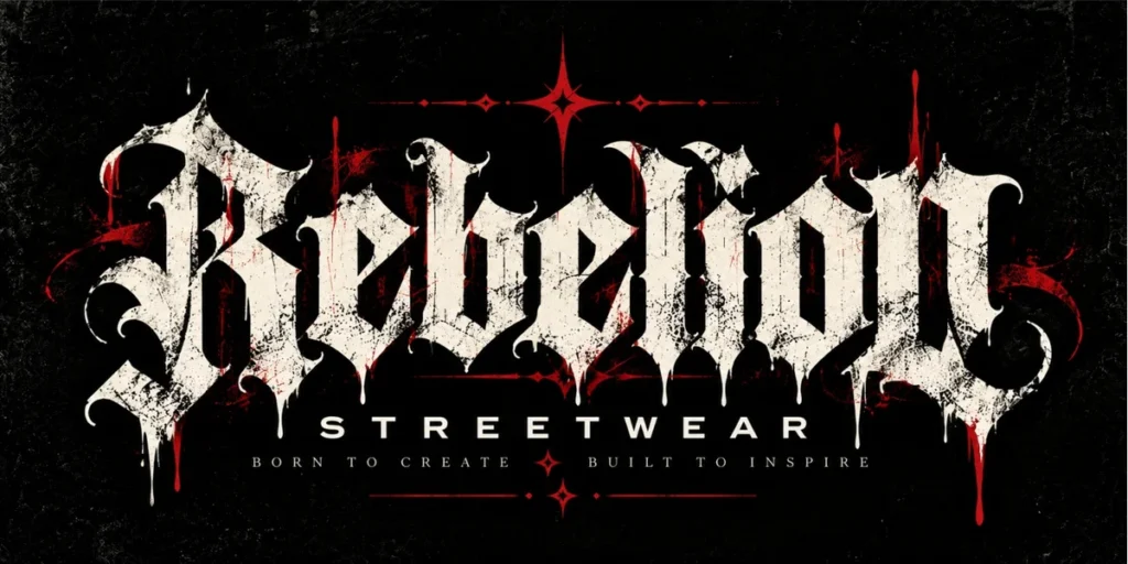
Best for: Alternative fashion, music posters, tattoo-inspired branding, and underground merchandise.
Blackletter typography carries a strong historical and subcultural character. It can communicate drama, rebellion, or a connection to metal, punk, and alternative music aesthetics.
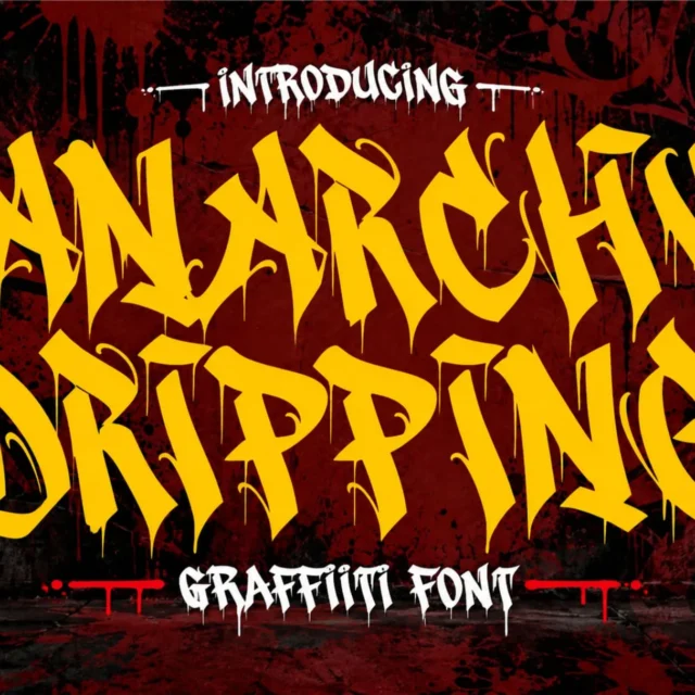
For a contemporary interpretation, pair a blackletter display font such as Anarchy Dripping – Blackletter Dripping Font with a neutral sans serif such as Inter.
The expressive blackletter treatment can be used for the brand name or main headline, while Inter handles dates, descriptions, product information, and other practical details.
Design tip: Reserve the decorative typeface for short text. Clean supporting typography is especially important when the headline contains complex letterforms or dripping details.
13. Display Font + Classic Serif
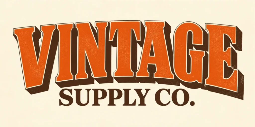
Best for: Editorial posters, fashion campaigns, premium product launches, and creative portfolios.
Combining a bold display font with a classic serif can produce an interesting contrast between modern expression and traditional refinement.
Try Astroph for a short, attention-grabbing headline and a classic serif such as Lora for the supporting copy. This approach can work when you want a design to feel both energetic and editorial.
For example, a fashion campaign might use the display font for the collection name and the serif for a short descriptive statement or editorial quotation.
Design tip: Keep the display font and serif visually distinct. Avoid choosing two typefaces that compete for the same role or have nearly identical proportions.
14. Expressive Graffiti Script + Minimal Sans Serif
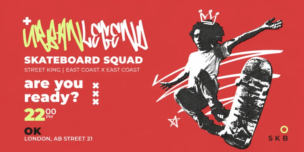
Best for: Creative branding, social media campaigns, music artwork, and independent merchandise.
An expressive graffiti script can introduce movement and personality into a design. When paired with a minimal sans serif, the contrast allows the handwritten style to stand out without making the whole composition feel busy.
Try Bombardies for a short expressive phrase, then use a neutral sans serif such as Open Sans for supporting text. This pairing is particularly suitable for creative studios, street-inspired lifestyle brands, and campaign graphics that need a human touch.
Design tip: Use the script for a short phrase rather than a long block of text. Keep the supporting information simple and leave enough negative space around the expressive lettering.
15. Layered Display Font + Clean Sans Serif for Social Media
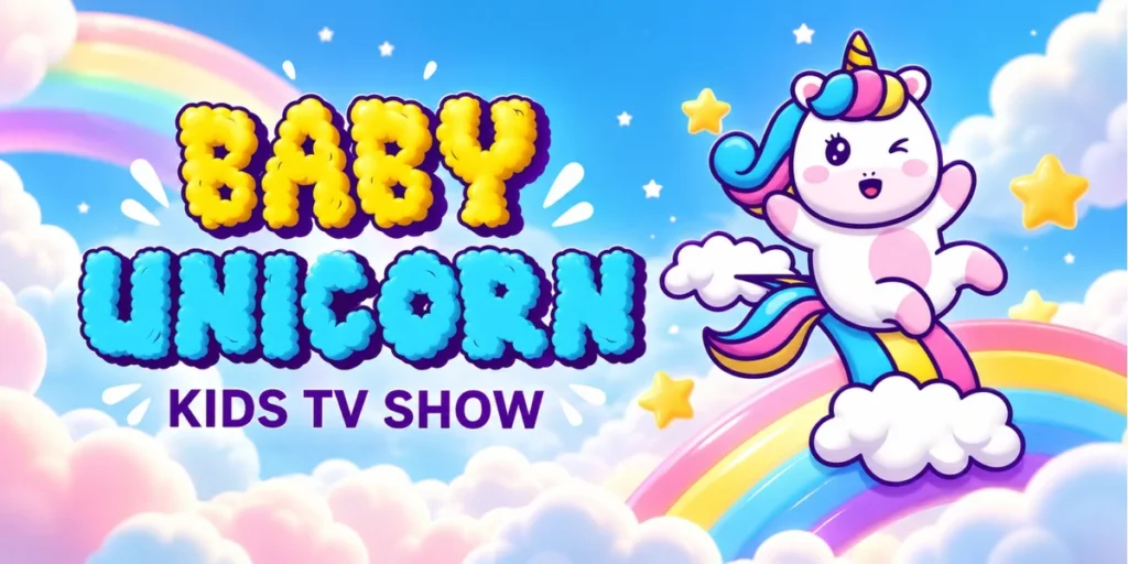
Best for: Instagram posts, YouTube thumbnails, digital advertisements, and promotional graphics.
Social media designs need to communicate quickly. A layered display font can attract attention in a crowded feed, while a clean sans serif makes the message easier to understand.
Use Clouds Well for a bold headline or short campaign phrase, then pair it with Inter for the supporting copy. Gruze offers multiple layered, melted, dripping, outline, and extruded styles, giving you room to build a distinctive typographic composition.
This combination works well for product announcements, campaign graphics, creative tutorials, and promotional content where the headline needs to stand out immediately.
Design tip: Check the design at mobile size. If the supporting text becomes too small or the display effects reduce readability, simplify the composition before publishing.
How to Apply Font Pairing Ideas to Different Design Projects
Choosing a good combination is only the first step. The next challenge is adapting the pairing to the format and purpose of your design.
Posters and Promotional Graphics
Posters need a strong focal point. Use a display font for the main message and a simpler sans serif for dates, locations, descriptions, or calls to action.
Keep the most important information prominent, and use spacing to separate the headline from supporting details. A visually impressive font pairing will not work if the audience cannot find the information they need.
Logos and Brand Identity
For branding, consider how the font combination communicates the personality of the business. A refined serif with a clean sans serif may suit a boutique brand, while an expressive display font paired with a neutral typeface can work for a streetwear label or creative studio.
Use the main font consistently in prominent brand elements, then define the supporting typeface for secondary communication. Before finalizing a logo, check the typeface’s license and whether your intended logo or trademark use is permitted.
Product Packaging
Packaging must balance personality and practical information. A distinctive display font can establish the product’s identity, while a readable sans serif or serif can organize descriptions, ingredients, product details, and other supporting text.
Always test the design at the actual packaging size. A combination that looks excellent on a large monitor may become difficult to read on a small label.
Social Media Graphics
For social media, choose a font pairing that remains recognizable at small sizes. A bold headline and a simple supporting typeface usually work better than several decorative styles competing for attention.
Use consistent fonts across a campaign to build recognition. However, you can vary the colors, images, and layouts to keep individual posts visually interesting.
Also Read: How to Install or Use Fonts on Canva
From Our Desk: Give Every Font a Purpose
At Cikareotype, we believe typography should do more than fill space. Letterforms can establish a brand’s personality, set the mood of a poster, and make a visual identity more memorable.
Our display fonts are designed for projects that need a distinctive typographic voice, including posters, branding, streetwear graphics, packaging, and social media artwork. The key is to give expressive lettering the right supporting role.
When working with a bold or decorative font, try pairing it with a simpler typeface rather than adding another equally complex style. This approach gives the display font room to stand out while helping the overall design remain organized.
You can explore the Cikareotype font collection to discover display fonts with different visual personalities. Start with the mood you want to communicate, then choose a supporting typeface that improves clarity and hierarchy.
Also Read: 5 Best-Selling Monoline Graffiti Fonts for Your Creative Projects
Common Font Pairing Mistakes to Avoid
Even a promising combination can become ineffective if the fonts are used without a clear plan.
- Using too many typefaces: Start with two fonts and add a third only when it has a specific purpose.
- Pairing fonts with similar personalities: If two typefaces look almost identical, the contrast may feel accidental rather than intentional.
- Ignoring readability: Decorative display fonts are usually better suited to short headlines than long paragraphs.
- Overusing decorative effects: Shadows, outlines, gradients, and extra textures can compete with the letterforms.
- Forgetting consistency: Reuse the same typographic roles throughout a brand system so the design feels connected.
- Skipping real-world testing: Preview your pairing on a phone, printed page, product label, or other final output before approving it.
Also Read: Best Graffiti Fonts for Social Media: How to Boost Your Brand Aesthetics
Conclusion
The best font pairing ideas are built around clear roles, purposeful contrast, and the needs of the design. A bold display font can attract attention, a serif can add sophistication, a sans serif can improve readability, and a script font can introduce a more personal touch.
You don’t need an elaborate combination to make a design look professional. Start with two typefaces, establish a clear hierarchy, and test them in the actual layout. Whether you’re designing a poster, developing a brand identity, creating product packaging, or publishing social media graphics, the right pairing can make your message clearer and your visual style more memorable.
Ready to explore more expressive typography? Browse the Cikareotype font collection to find display fonts for your next branding, poster, packaging, or social media project.